Future Shock – 180 Studios, London
A review of Future Shock, an exhibition of digital art at 180 Studios on the Strand, London. London’s coolest exhibition space strikes again!
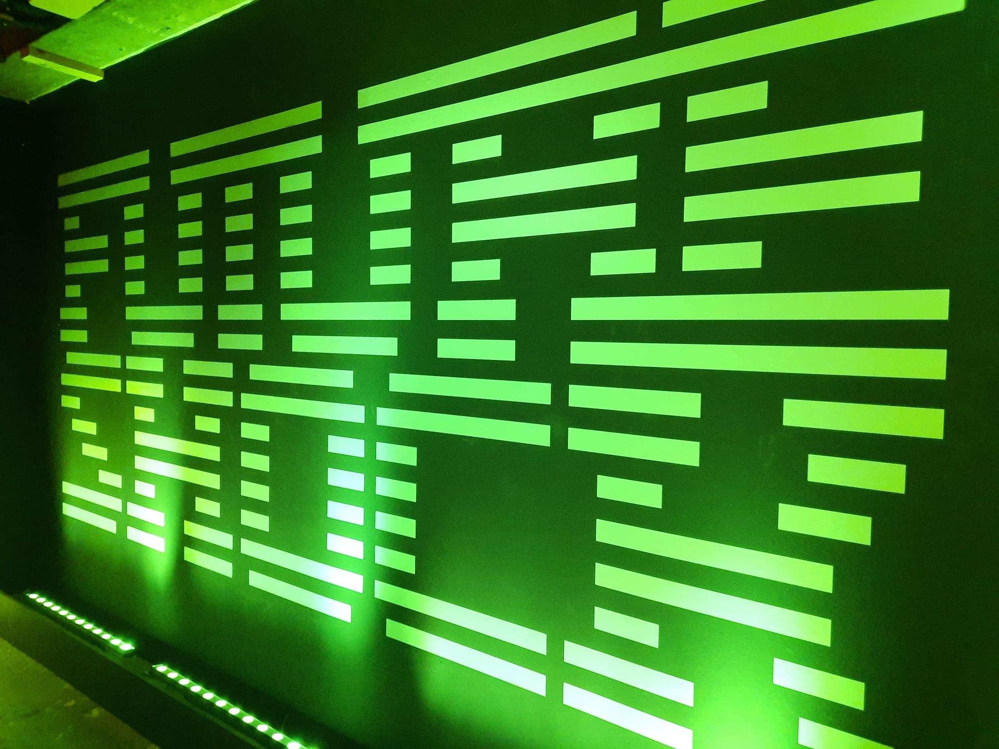
Back At 180 Studios
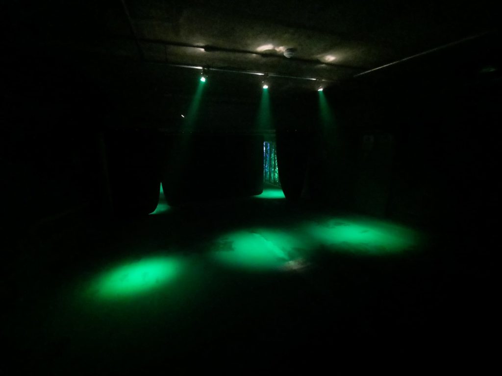
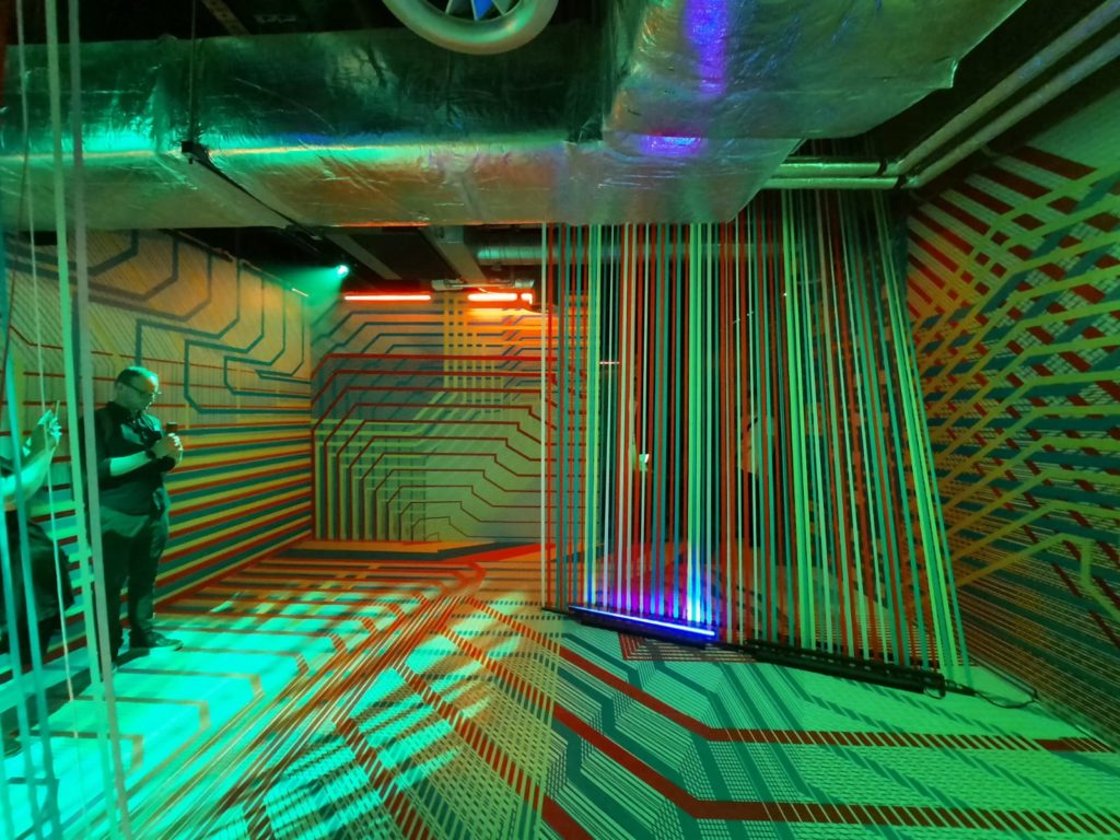
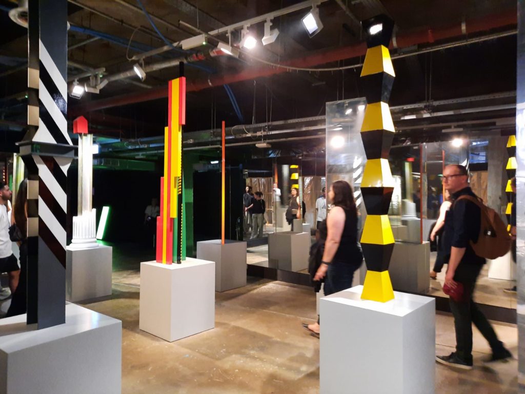
The latest exhibition from 180 Studios (on London’s Strand) is entitled Future Shock. It’s an exhibition of digital art, with the industrial basement space divided into separate sections to view each artwork. In my opinion this is one of London’s coolest art spaces, like going to some kind of Berlin nightclub without having to stay up late.
This is the third time the Salterton Arts Review has been to 180 Studios. The first was an exhibition of work by Ryoji Ikeda. The second was much more comparable to Future Shock; Lux was a curated exhibition of work by different digital artists, focusing on light and perception. Only, you could almost have swapped the titles/concepts between Lux and Future Shock and I would have believed you. You could say basically any digital art is about light and perception. And a lot of it tends to look at our future, either because that’s a preoccupation of artists generally in such an uncertain age, or because it uses cutting-edge technologies that encourage projections into our own near future.
All this probably comes across as quite cynical. Maybe it is. But unless the next big exhibition from 180 Studios is something substantially different, my advice would be to go at least once to see the space and some cool new art, but not to worry about going to everything they put on.
Future Shock
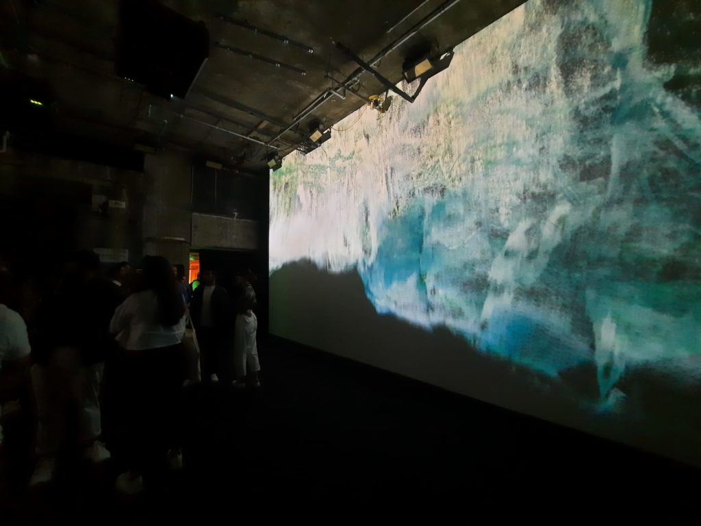
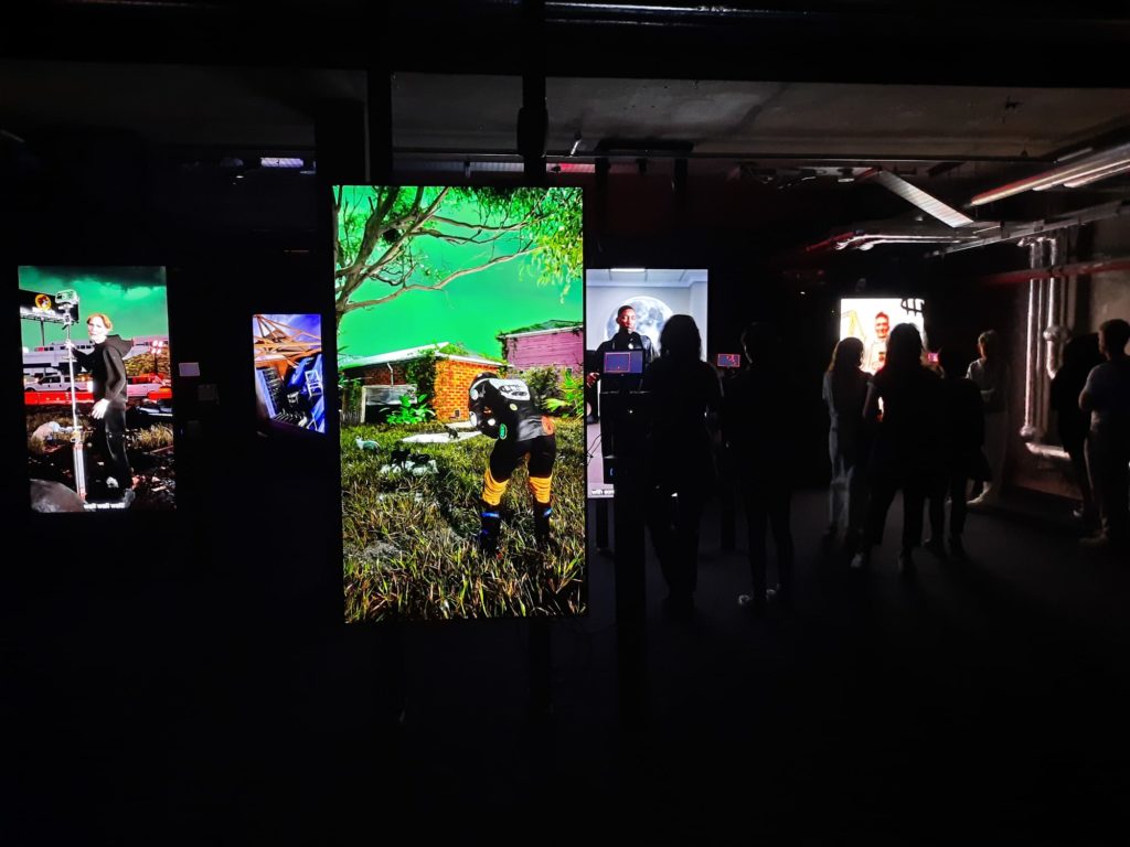
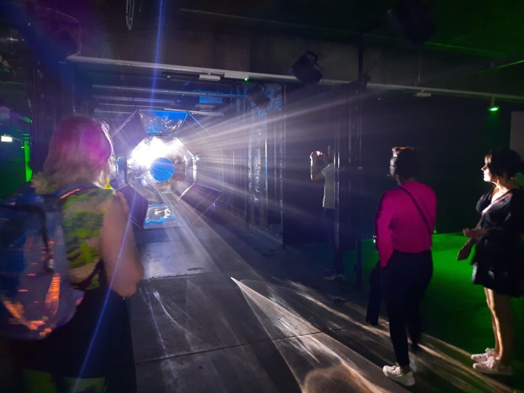
Future Shock is nonetheless a distinct exhibition with different artworks and artists than I’ve seen before. So what’s on view? Like other exhibitions I’ve seen here, the artworks are down in the building’s basement, which is kept dark and has multiple attendants to ensure you don’t get lost. Most digital artworks are in some ways immersive, so you need space to take each one in. There’s more or less a one-way flow, which means that the curators can start and end with big bang, impressive works.
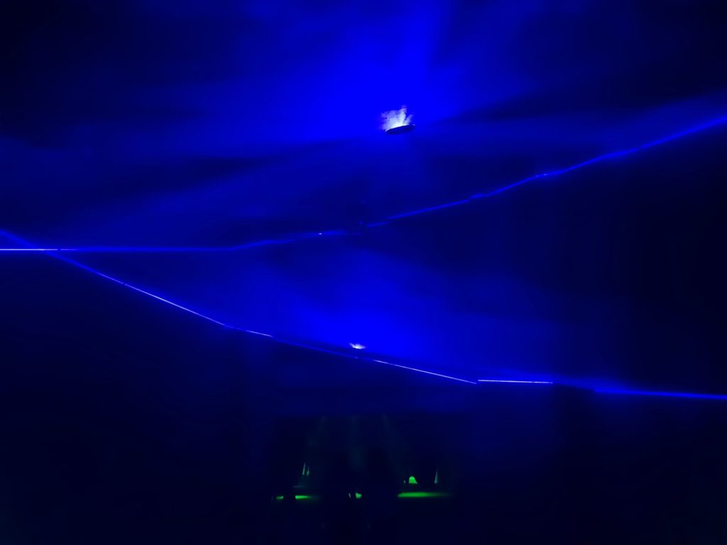
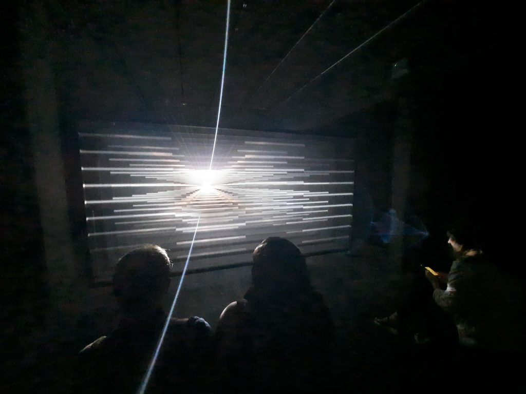
For Future Shock, this means starting with Ryoichi Kurokawa’s trippy Subassemblies, where spaces unfold endlessly across screens on opposite sides of a large room. UVA’s Topologies is up next, a larger transitional space before you reach the main level of the exhibition, with lasers projecting planes of light onto dry ice smoke. It’s not the most cutting edge of technologies on view, but it’s impressive. At the end of the exhibition you come across Hamill Industries’ Vortex, an interactive light, smoke and sound display.
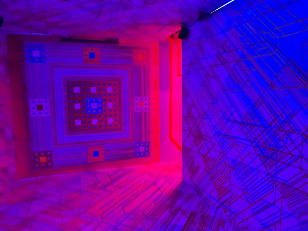
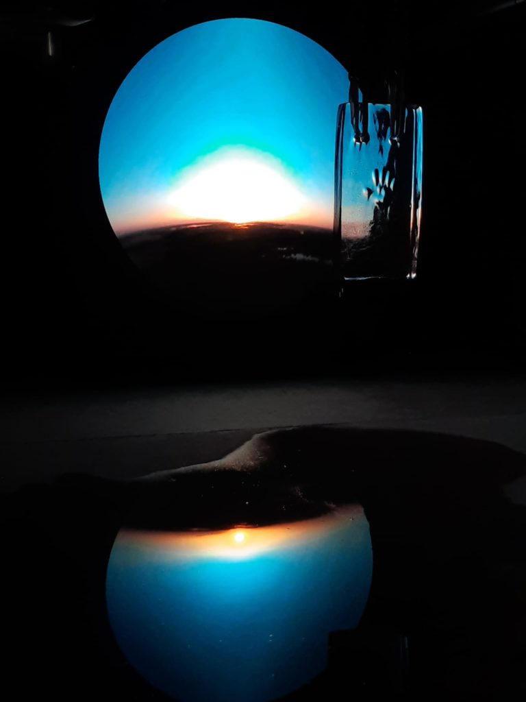
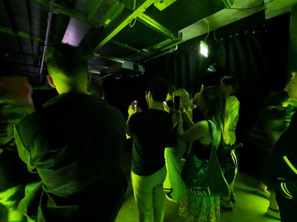
The rest of the artworks project a similar sense of ‘technology meets cool visual effects’. There’s AI in there, UV lights, mirrors, and 3D illusions. It’s super Instagrammable so everyone’s on their phones, so much so that when there’s a narrow viewing point you get bottlenecks. I couldn’t even really get near What Melissa Said by Object Blue. Some artworks are a little more old school: Vigil, for instance, by Caterina Barbieri and Ruben Spini, relies on a great visual effect from a melting block of ice. There’s a little bit of everything in Future Shock.
What Does It Tell Us About The Future?
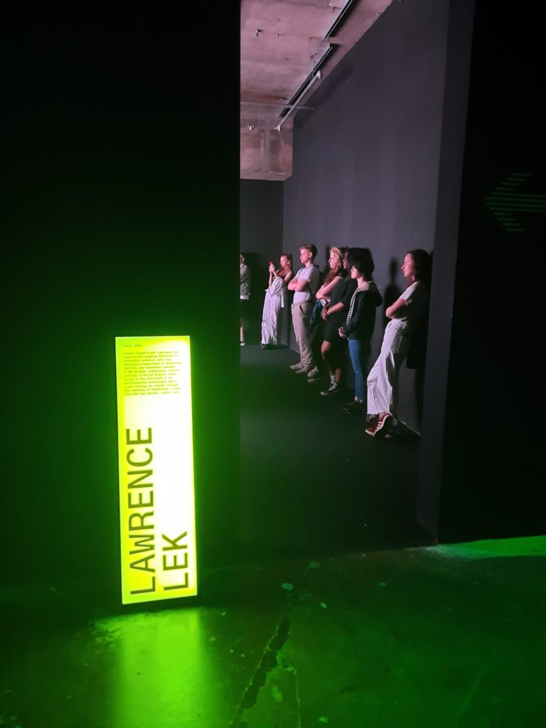
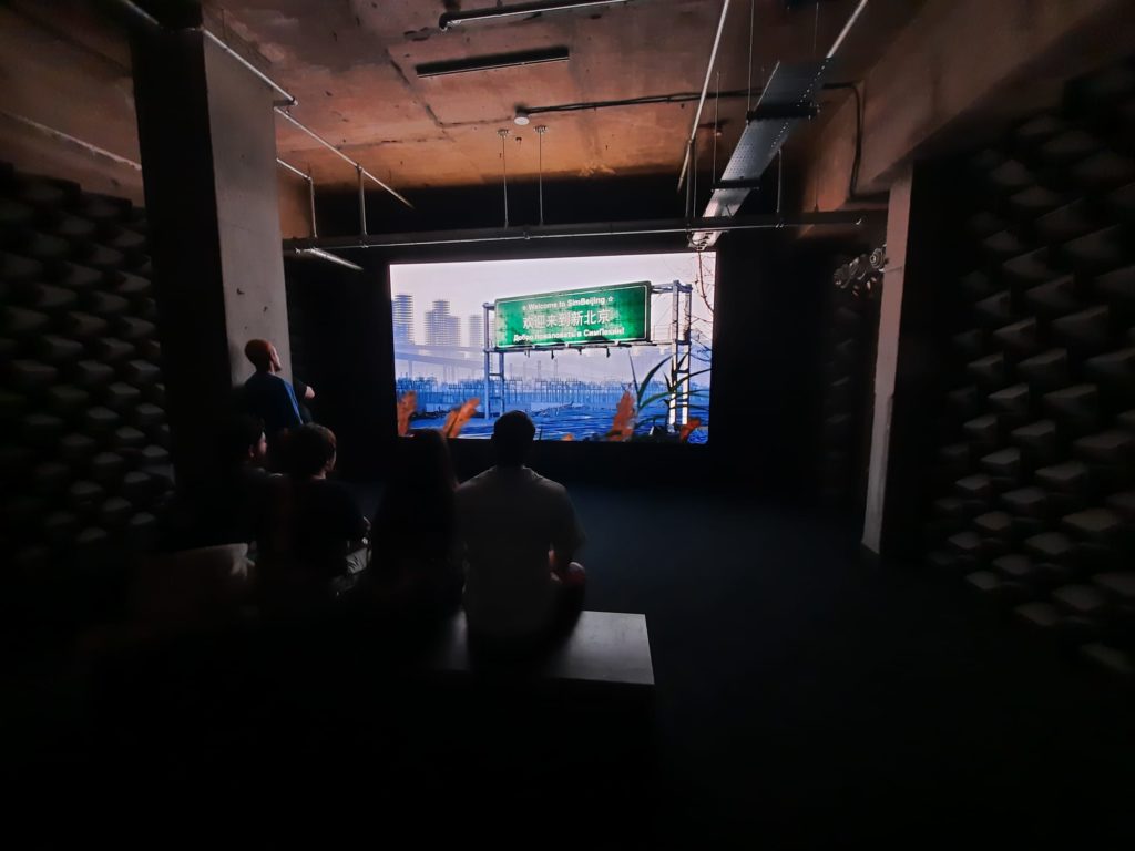
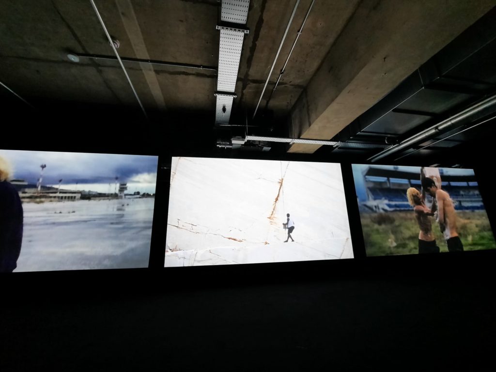
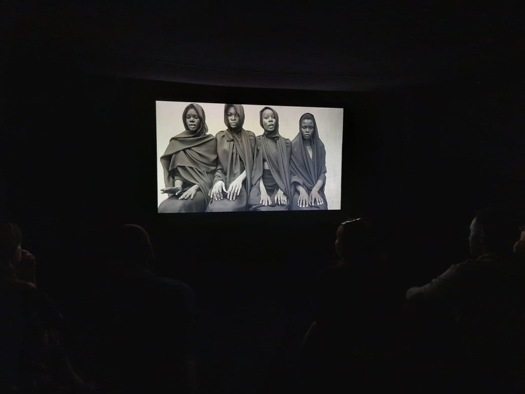
If I’m honest, not much. Some of the artworks in Future Shock were about our near future. Lawrence Lek’s Theta, for instance, is an intriguing digital film set in a post-apocalypic Beijing. Or there’s Neo Surf, a collaboration between filmmaker Romain Gavras and electronic music producer Surkin. This slow and dreamy film, projected onto multiple screens, is beautiful. It reminded me a lot of Kehinde Wiley’s Prelude. Part of it is shot in an empty marble quarry, which as a location is stunning. But anyway, the description of this artwork tells us that it’s set in 2034, and I believe them. It’s our world, but a little different. A little threatening, maybe. A chance to work through our anxieties about what’s ahead.
Those types of artworks live up to the exhibition’s theme. There are plenty more where I felt the descriptions or connections were a little contrived. Interesting visual effects which are good enough on their own, twisted to find some sort of narrative where they are from a future world. Information panels where the language is so convoluted that nobody could really claim to fully understand what it’s all about. Sometimes it’s ok for things just to be digital art, they don’t need to be fitted to a theme for us to enjoy them.
Final Thoughts on Future Shock
Really what I’m saying here boils down to: if you haven’t been to 180 Studios before, then go to this exhibition! Some of the digital art is really fun, some is thought provoking, some will look good on Instagram. The space is amazing, and you will feel like part of a crowd of art world insiders. If you’ve been before to 180 Studios, then you can probably take it or leave it. There was no one artwork that was so brilliant I would advise going just to see it. It probably depends how much you like digital art overall. Or whether you have an afternoon to spare and want to do something interesting with it.
I’ll be really interested to see what 180 Studios do next. Perhaps I’m wrong and there is a sufficient crowd of digital art enthusiasts who have an endless appetite for more of the same. But I definitely came away feeling a little cynical about the imposition of themes on artworks that should just be enough on their own. Although watch this space, it’s entirely possible I won’t be able to resist the lure of the industrial corridors of 180 The Strand and will be back again, chasing a digital art high.
Salterton Arts Review’s rating: 2.5/5
Future Shock on until 28 August 2022
Trending
If you see this after your page is loaded completely, leafletJS files are missing.

