Ai Weiwei: Making Sense – The Design Museum, London
The placement of this exhibition of art by Ai Weiwei in London’s Design Museum prompts us to think about the meanings of art and objects. Ai Weiwei: Making Sense adds ever more layers onto the work of this most famous of Chinese contemporary artists.
Ai Weiwei: Making Sense
It’s been a while since I’ve ventured over to West London and the Design Museum. Last time it was to see work by Charlotte Perriand, a mainstay of mid-20th Century French design. This time I was here to see contemporary art by none other than Ai Weiwei.
Ai Weiwei: Making Sense is an exhibition of work by the Chinese artist spanning more than 20 years. Ai takes over the museum’s ground floor exhibition space, with several large installations, a number of smaller works and a handful of videos. The interesting thing, though, is that the exhibition is at this museum at all. Ai is an artist, not a designer, so what is this exhibition doing here?
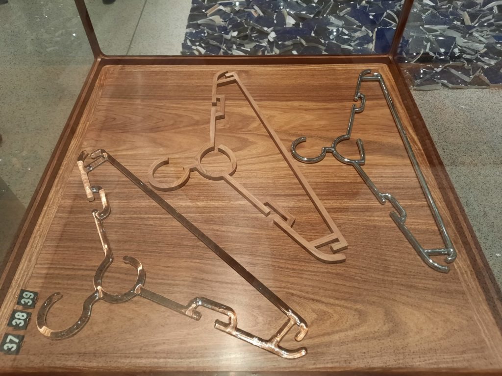
Well, the premise behind the exhibition is that so much of Ai’s art is about the process of making. And sometimes of un-making. It’s about materials, techniques, and the value we place on objects. Thinking about this as a meditation on design shines a different light on the artworks than, say, the last large-scale exhibition of his work in London at the Royal Academy in 2015. Let’s dig into how, exactly.



A History Of Mass Production
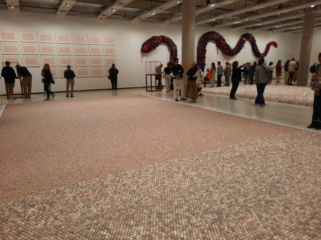
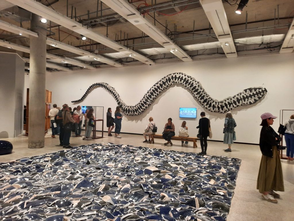
The layout of the exhibition is very interesting. It’s in an exhibition space at the Design Museum which usually has dividers or walls of some kind to create a flow. This time all of that is removed, so it’s essentially one big hall. Ai’s works themselves create the spaces.
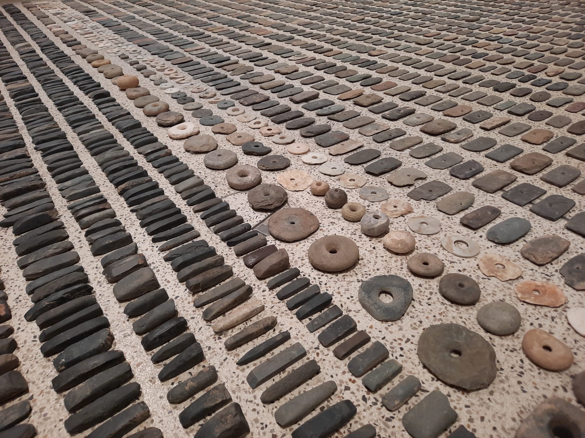
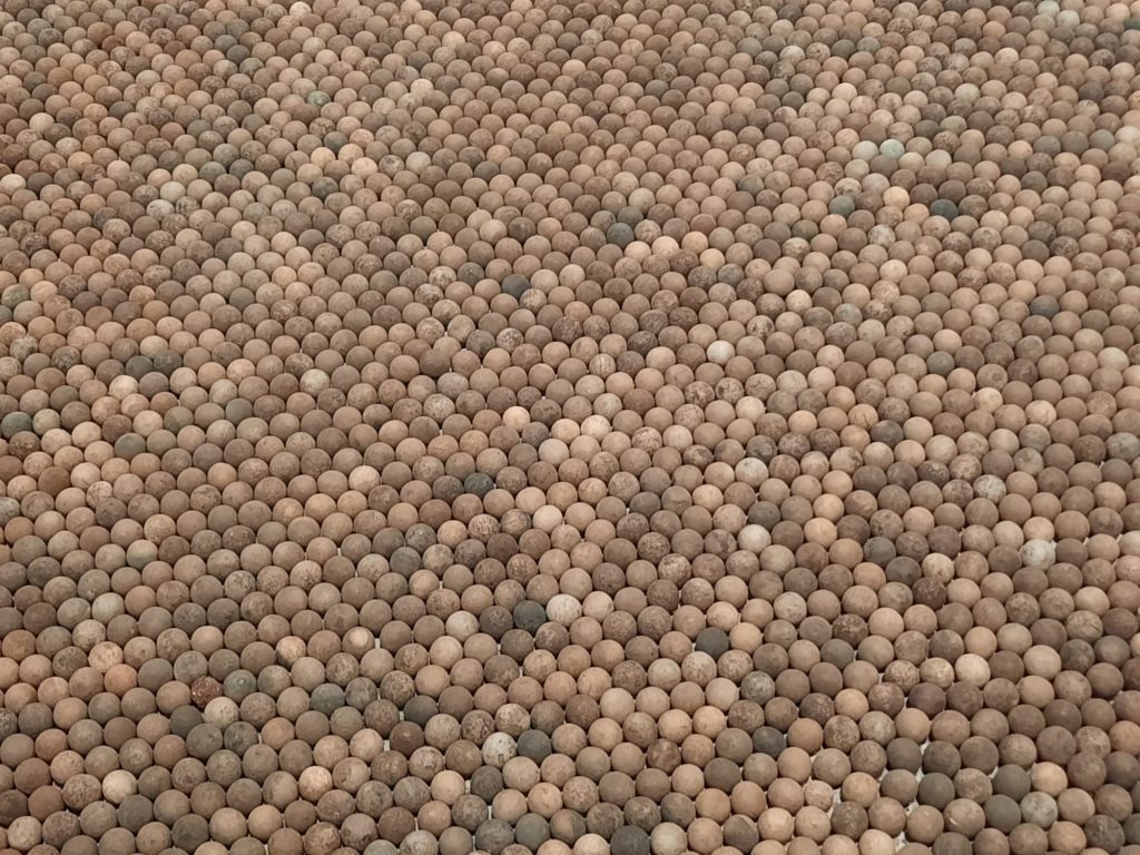
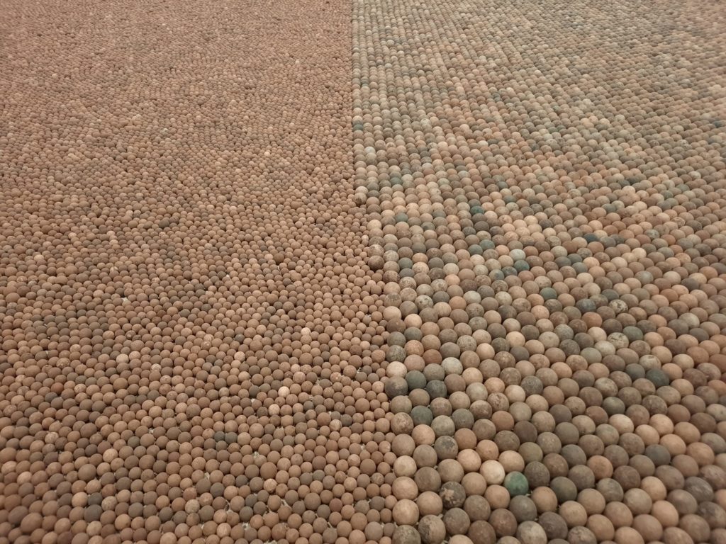
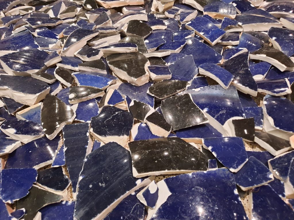
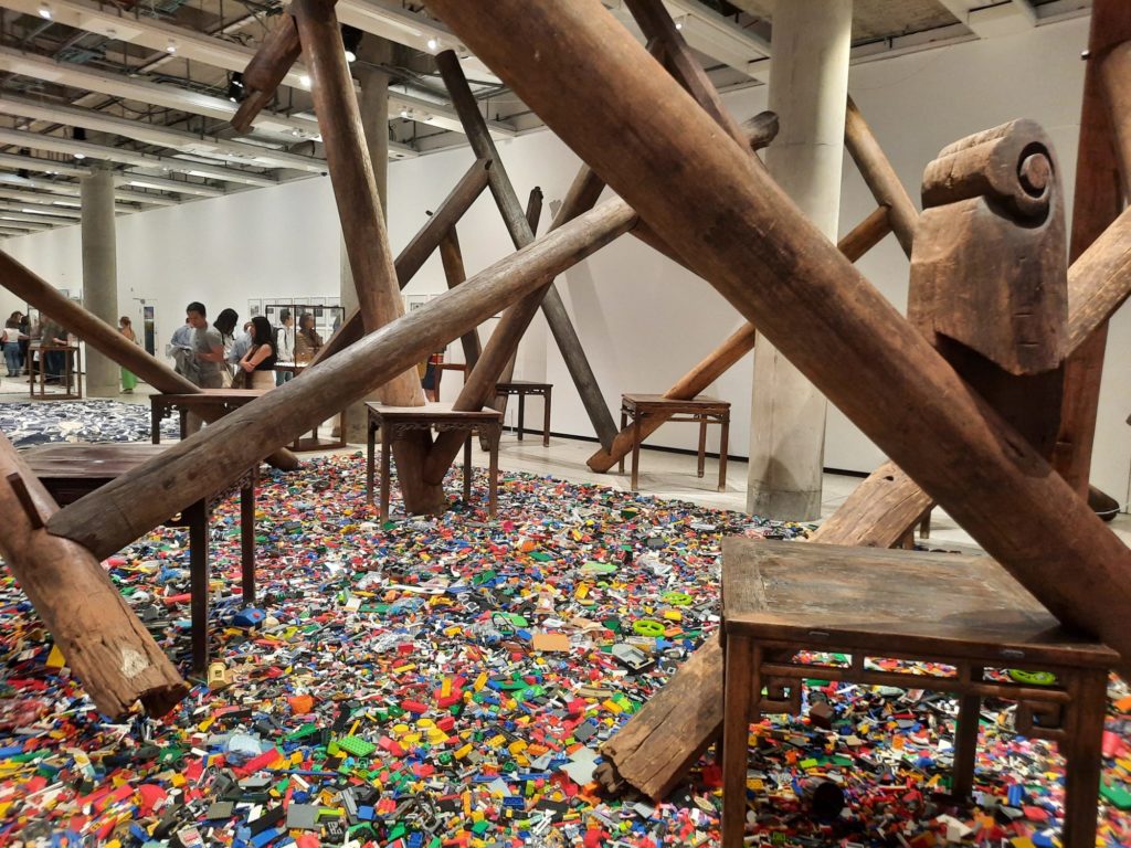
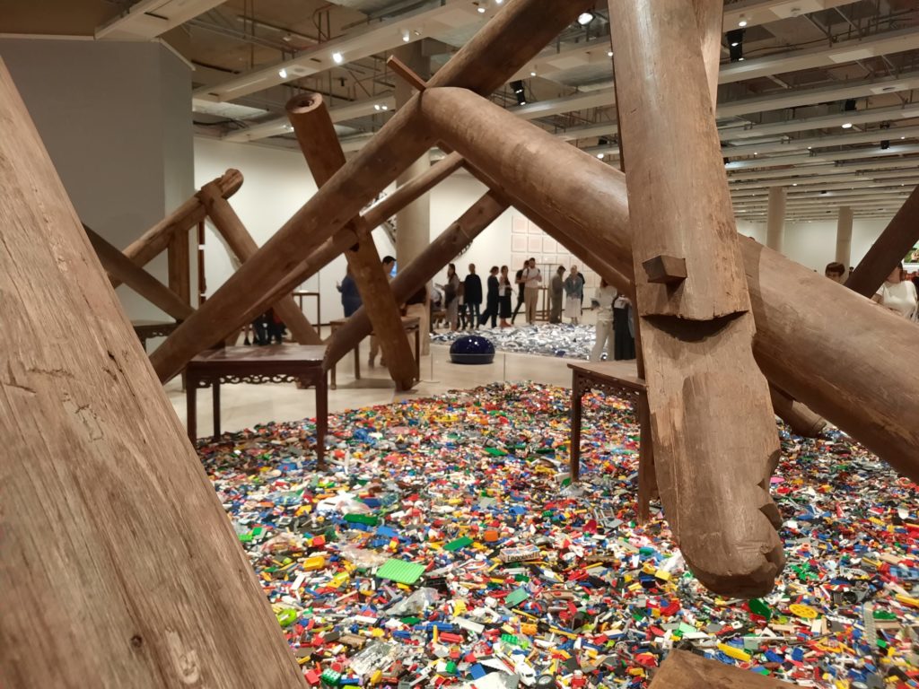
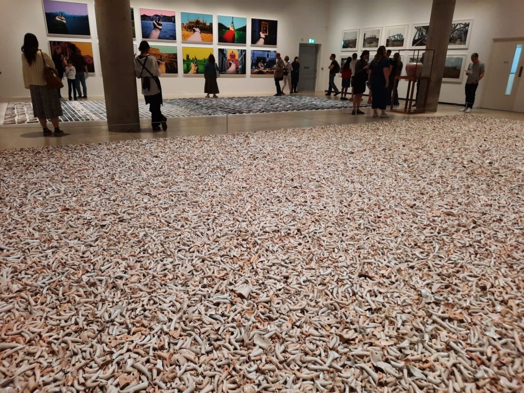
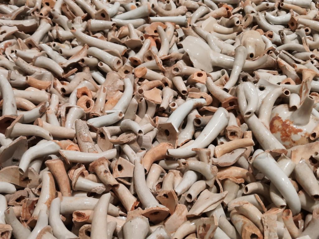
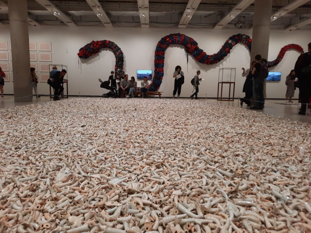
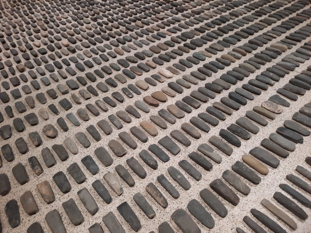
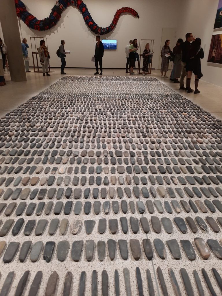
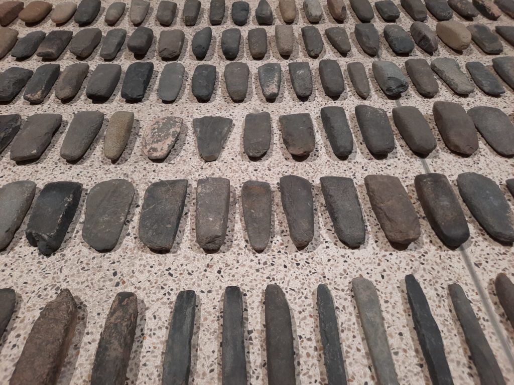
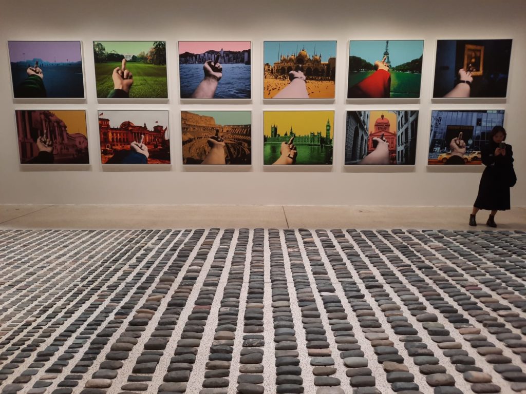
Mostly this is achieved through the inclusion of five enormous works which take up almost the entirety of the floor space. Each is made up of many almost identical objects, laid out or arranged in rectangles on the floor. As you enter, they can be ‘read’ from right to left like Chinese script – deliberate or coincidence? Read in this order they run the full historical gamut from neolithic hand tools bought in antique shops and flea markets, to a sea of Lego blocks. In between are hundreds of thousands of spouts broken off imperfect teapots, Song dynasty projectiles used in weapons, and fragments of porcelain spheres, destroyed when Ai’s studio was razed in 2018.
What does the juxtaposition of these artworks tell us? Firstly, a lot about design and mass production. We tend to think about mass production as a feature of the Industrial Revolution. Piece work at home moved to factories, hand-crafted objects replaced by cheaper surrogates. Yet here are dozens of artefacts dating all the way back to the stone age. There are several object ‘types’, yet very little variation between the objects themselves. Yes they were handmade, but the object was production at scale. Such scale, in fact, that they had become unvalued despite their immense age, picked up by Ai at little cost.


Materials, History And Design
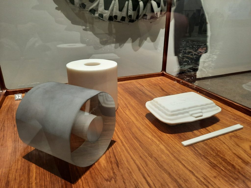
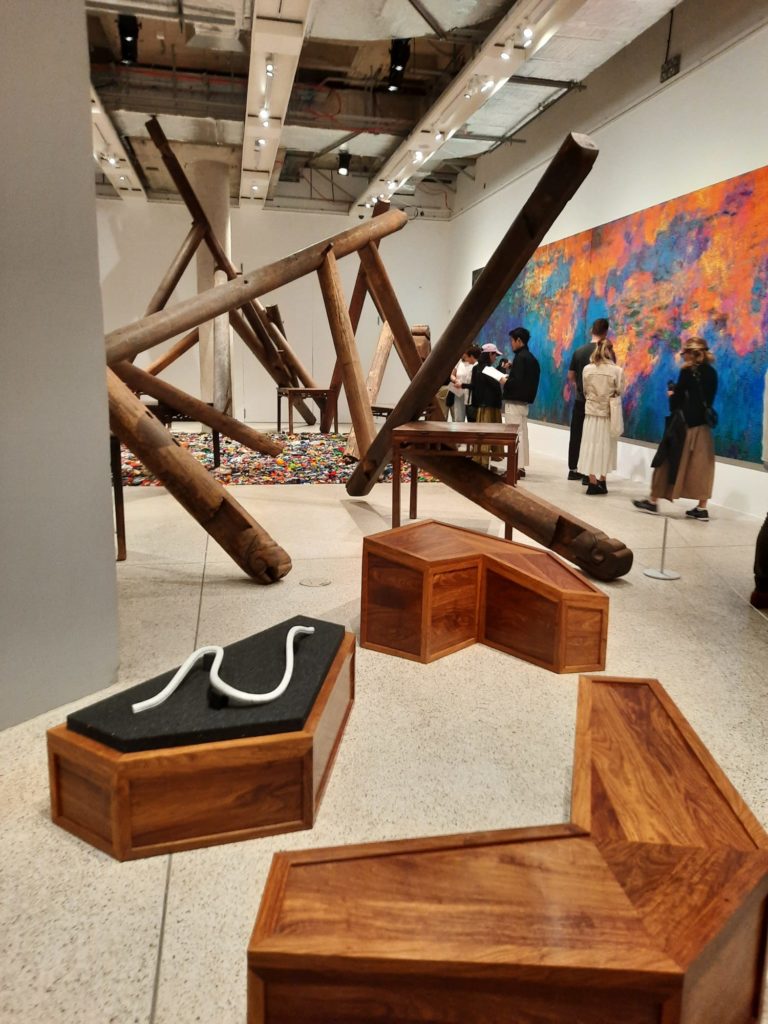
To expand a little on this idea about design, technology and the value of objects, some of the smaller scale works in the exhibition also align with this theme. Ai frequently plays with form and material to encourage us to reflect on this value-making process. For instance, both inside and outside the museum are rolls of toilet paper. OK, not actual toilet paper, but toilet paper recreated in glass or stone. It is not that long ago that toilet paper was the symbol of a mass panic, people stock piling it or selling at inflated process. Similarly, toilet paper was considered a luxury during Ai’s childhood. The value of things, he is telling us, is not merely its use or material value but something we assign to it.
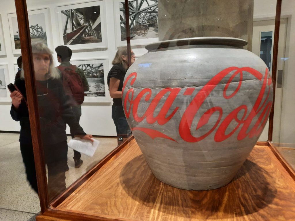
As a museologist and big time museum nerd, it is Ai’s habit of drawing attention to this value creation through destruction which is the most confronting. You may be aware of his 1995 performance work destroying a 2,000 year-old urn. In Ai Weiwei: Making Sense there is a similarly historic vessel painted over with a Coca Cola logo. Or one of those neolithic tools with an iPhone cut out of it. This apparent lack of reverence makes me uncomfortable, but at the same time it’s that feeling of discomfort which encourages me to reflect on why I understand certain things to have a value outside of their intrinsic purpose. In a country which has seen such a rapid scale of change and erasure of a lot of material history, it feels a clever way to address an urgent topic.


Exhibition Highlights
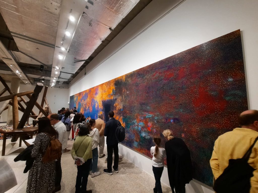
So we’ve done quite a bit of pondering: what did I actually think of the experience of visiting Ai Weiwei: Making Sense? In short, I really enjoyed it. For me, Ai is an artist who balances the concept with the aesthetics. I can get on board with an idea, provided the resulting artwork is aesthetically pleasing or at least aesthetically interesting. And Ai checks those boxes.
There was a quality to some of the large works of repetitive objects which I found very soothing. In particular the ceramic projectiles, despite their violent purpose. The neat lines, the soft colours, were all very restful to my eyes and brain. I came back to it several times during my visit, and spent lengthy stretches contemplating the other large-scale works as well.
There are a few images from Ai’s project Middle Finger on one wall. If you’re not aware, this is a project in which Ai photographs his hand giving the finger to various famous landmarks. He even encourages the public to get involved. Very entertaining, 10/10.
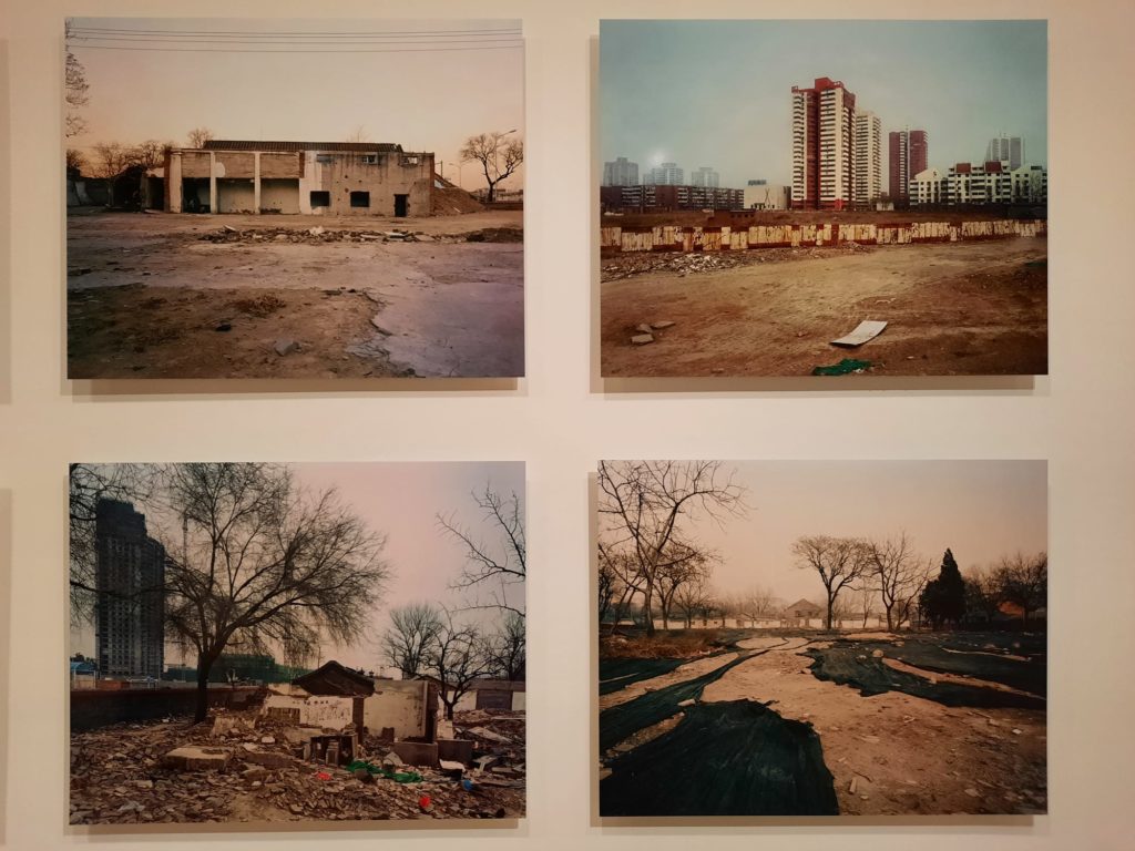
Finally, as a historian, I appreciated the inclusion of some of Ai’s artworks which are records of a changing place. As I mentioned above, China has experienced an unprecedented pace of development in recent decades. Ai’s films on the streets of Beijing have a certain poignancy as records of places that no longer exist. The same with his photographs of construction sites. Part documentary, but always part commentary as well.

Final Thoughts On Ai Weiwei: Making Space
By the end, I was very much convinced by this exhibition’s placement at the Design Museum. For me, positioning these artworks within a design context got me thinking about different meanings than what I got out of the 2015 exhibition, for instance. Ai’s work is multi-layered and very considered, so opening up these new aspects and connections helps visitors to get to know him better as an artist.
When I entered the exhibition, its layout as a single room had me thinking “is that all?” But in the end I think it was a very nice size – just enough to see artworks from different series and in different media, but not enough to start to get tired or bored. Turns out they know what they’re doing, those curators!
I highly recommend Ai Weiwei: Making Sense, whether you’re already familiar with the artist’s work or not. For those who are not, it’s a great introduction as it contains snapshots from long-running series and tasters of different techniques Ai uses frequently. If you already know something of his work, framing it within a design context is a revelation for all the reasons outlined above. So no reason not to go, really.
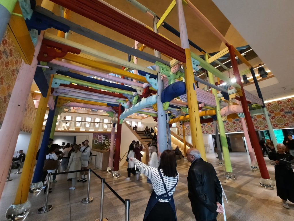
If you do go, don’t miss the artworks outside the exhibition space. I mentioned outdoor works above: there are several. And a wallpaper which, while different in nature, recalled History of Bombs which I saw at the Imperial War Museum some time ago. I like the inclusiveness of artworks spilling over into public areas from the paid exhibition space, and these ones add nicely to what’s inside.
Salterton Arts Review’s rating: 4.5/5
Ai Weiwei: Making Sense on until 30 July 2023
Trending
If you see this after your page is loaded completely, leafletJS files are missing.

