Young V&A, London
Young V&A is the latest incarnation of the V&A’s East London branch dedicated to childhood. After a three-year renovation project, this new version is very much a museum for children rather than about them.
A History Of Young V&A
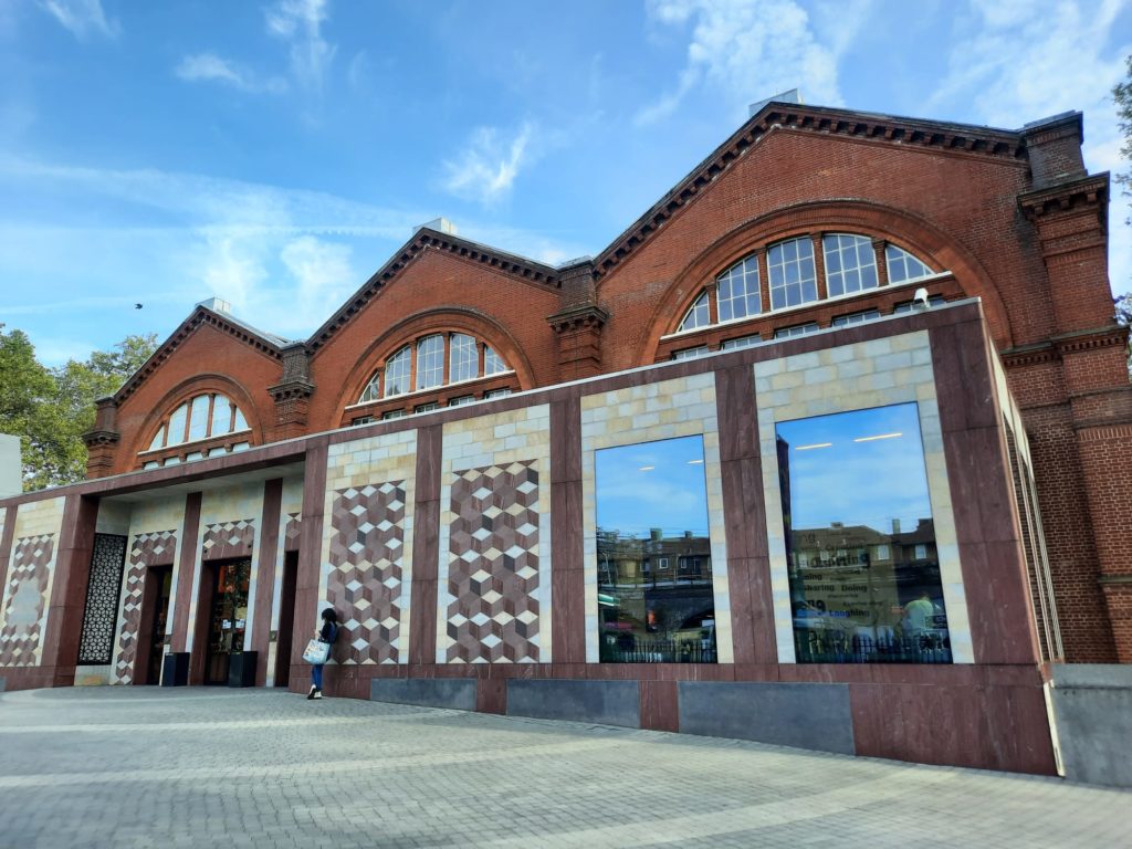
Young V&A is the latest incarnation of a museum which goes back to the Great Exhibition of the 1850s. Or parts of it, at least. Specifically its iron frame, which began life supporting the South Kensington Museum within the Great Exhibition. Clad at that time in corrugated iron, it earned the disparaging nickname the ‘Brompton Boilers’. As the South Kensington Museum (which is today’s Victoria & Albert Museum or V&A) moved into a more permanent residence, an opportunity arose to reuse the structure.
And as luck would have it, Bethnal Green, who had been campaigning for a museum for some time at this stage, were selected as the museum structure’s new home. This time architect James W. Wild encased it in red brick rather than corrugated iron, altogether a nicer-looking solution and one that has passed the test of time.
The Bethnal Green Museum, from the outset, displayed parts of the collection of the South Kensington Museum/V&A. At the start this was quite general, the idea being to bring culture “to the masses” in the East End. First this was food and animal products, then art (including the Wallace Collection at one point). After WWI it was remodeled as an art museum, and contained a children’s section which started growing in size. It grew so much, in fact, that the museum was eventually renamed the Bethnal Green Museum of Childhood. This was later the V&A Museum of Childhood.

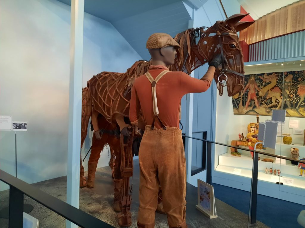
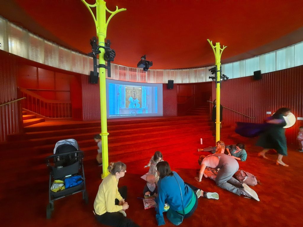
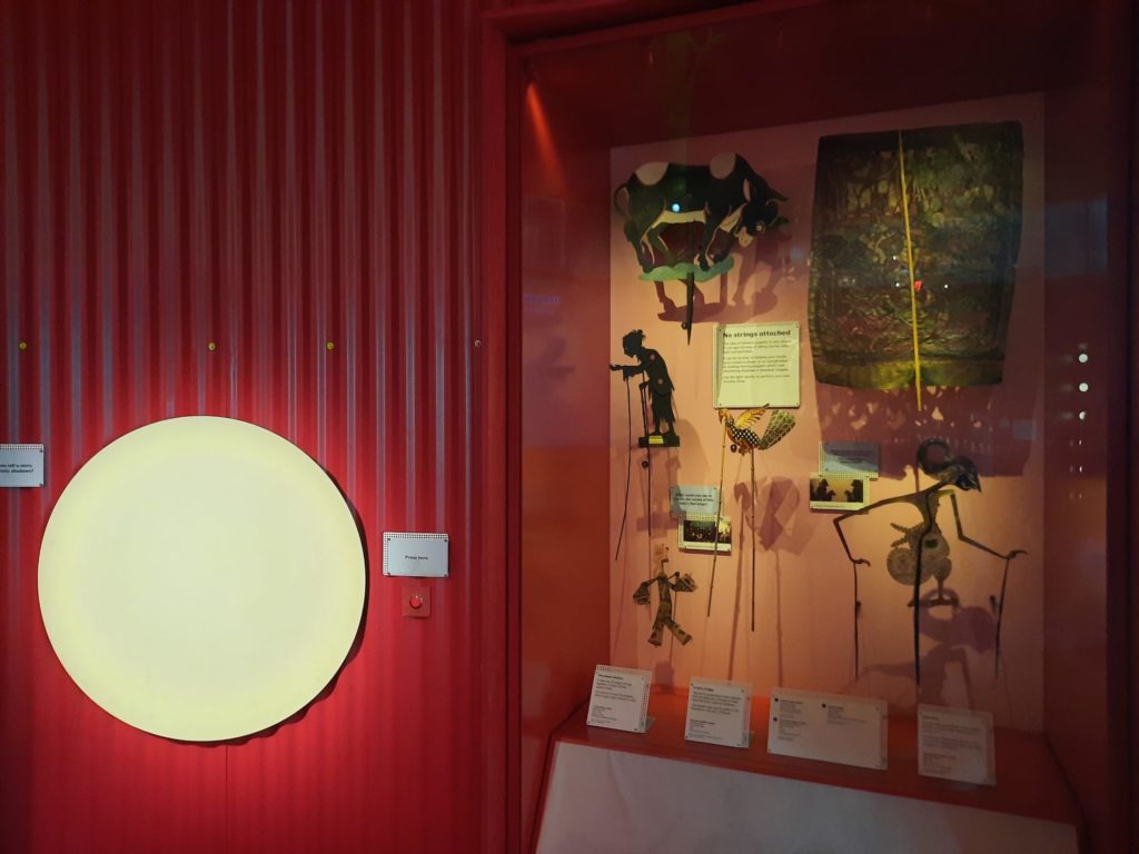

A Museum About Children Or For Children?
It’s all very well having a museum of childhood, but what does that really mean? For many years in its previous incarnation, this primarily meant a museum about children. Toys from the past were put on display, delighting adults who remembered them fondly, but less interesting from the point of view of children visiting the museum.
There is no mistaking a wholesale shift in the museum’s latest incarnation. After a three year closure, the museum has reopened (about a year later than intended) as Young V&A. Although Young V&A has something for visitors young and old, it’s the younger visitors that are the heart of the experience. According to V&A Director Tristram Hunt, it’s now all about ‘creative confidence and cultural capital’. This is a museum for young people and about design. Objects are pulled from across the V&A’s collection, illuminating design thinking and processes and attempting to start conversations amongst families.
The change won’t be for everyone: there will be those who enjoyed and lament the museum’s more nostalgic format. But my recent visit was actually the first time I’d been, meaning a good opportunity to see Young V&A not quite through the eyes of a child, but through fresh eyes at least.
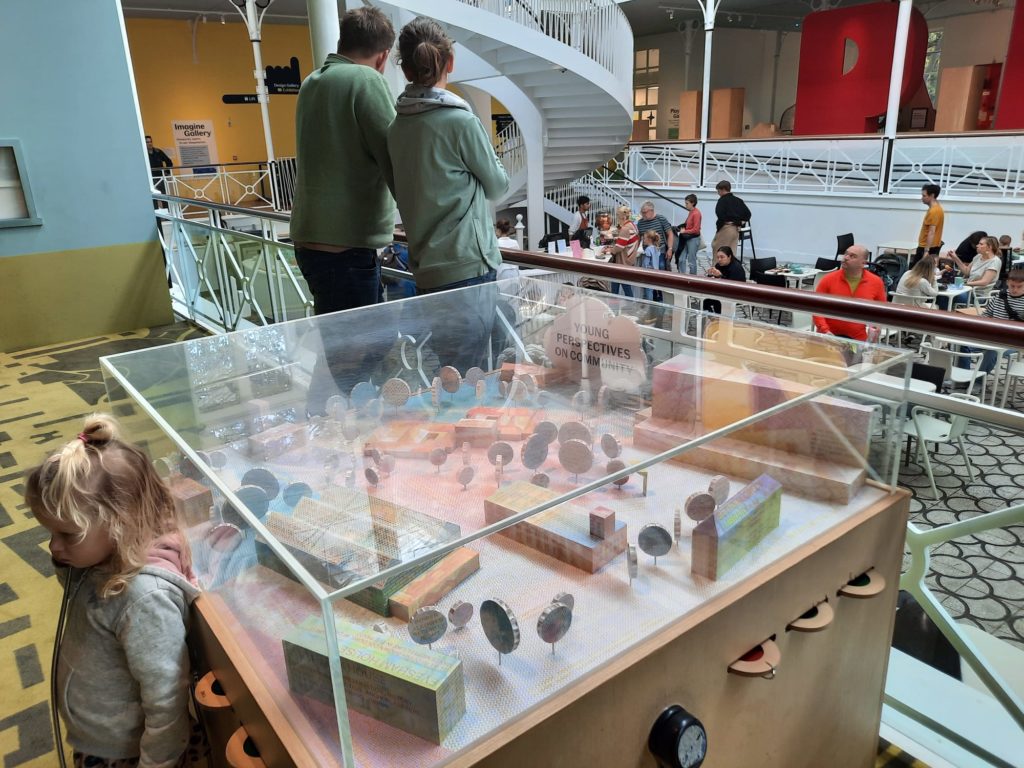


Imagine
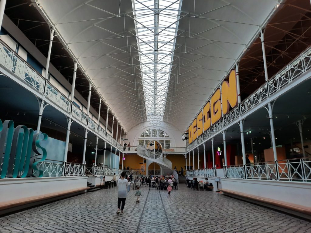
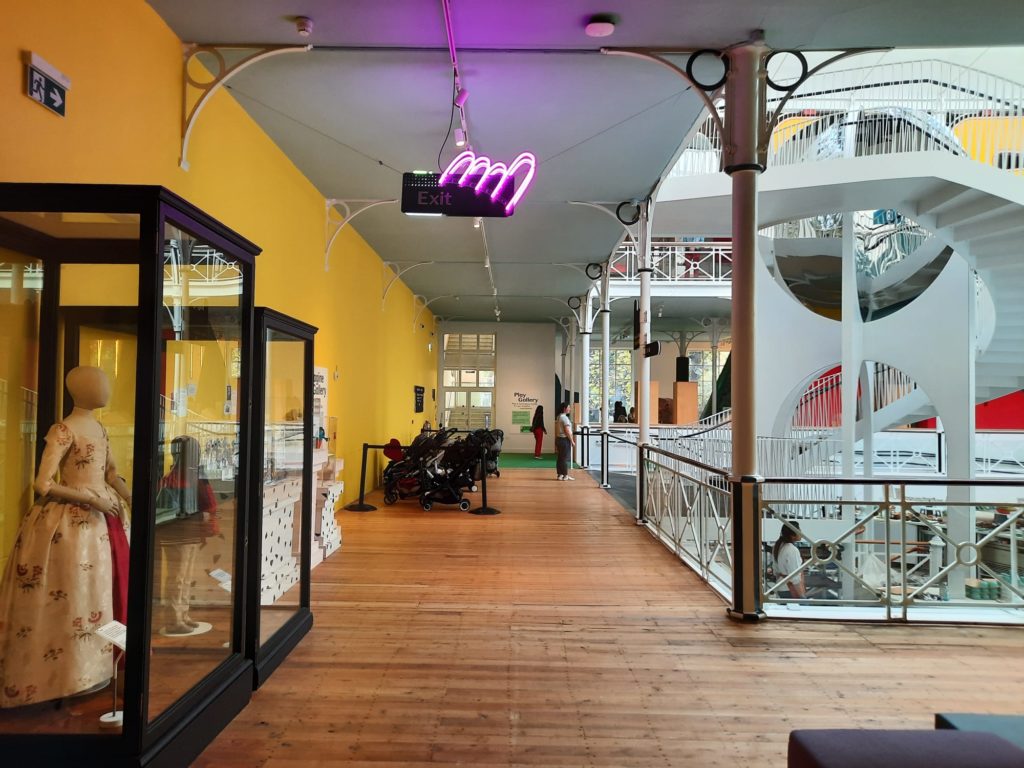
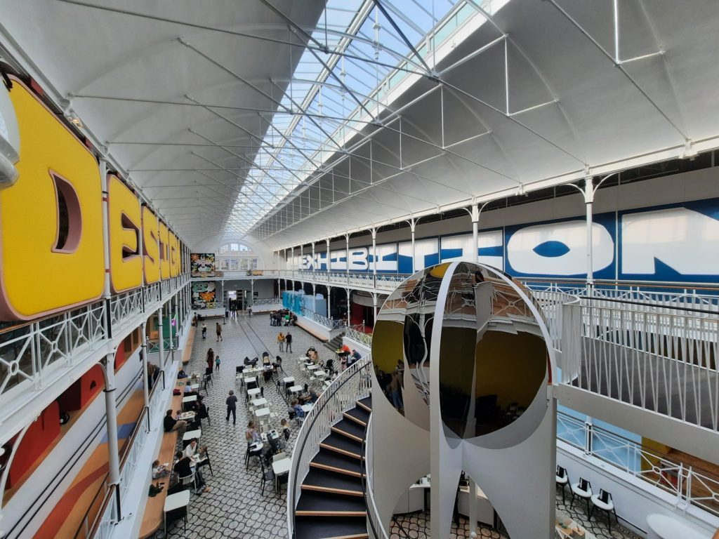
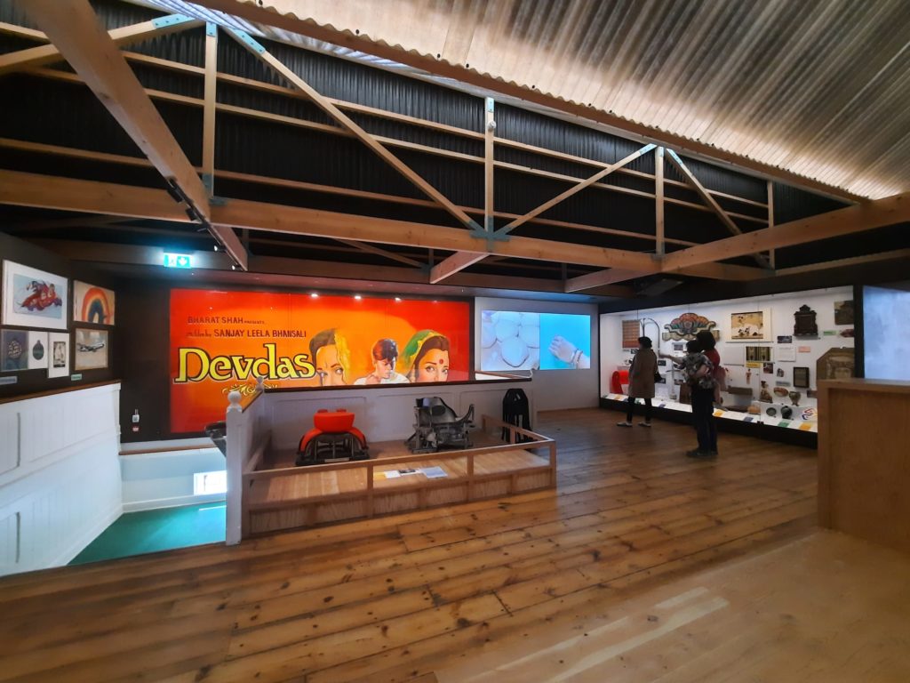
Young V&A’s layout, with a central hall flanked by galleries on either side, lends itself to creating distinctive sections and a good flow. Imagine you’re standing in the entrance way, facing into the museum. On the left you will see ‘Imagine’ in large letters on the lower floor, and a temporary exhibition space above. On the right, ‘Design’ is emblazoned upstairs, with a series of spaces for play below.
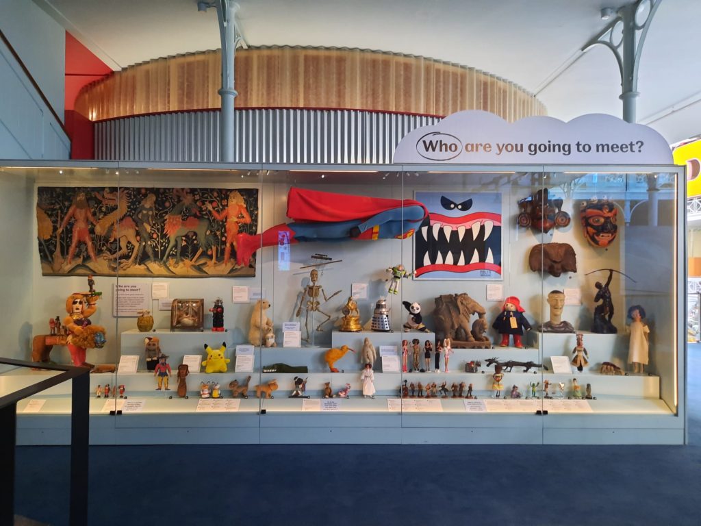
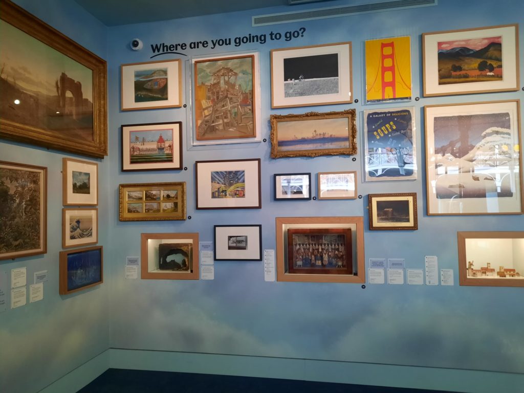
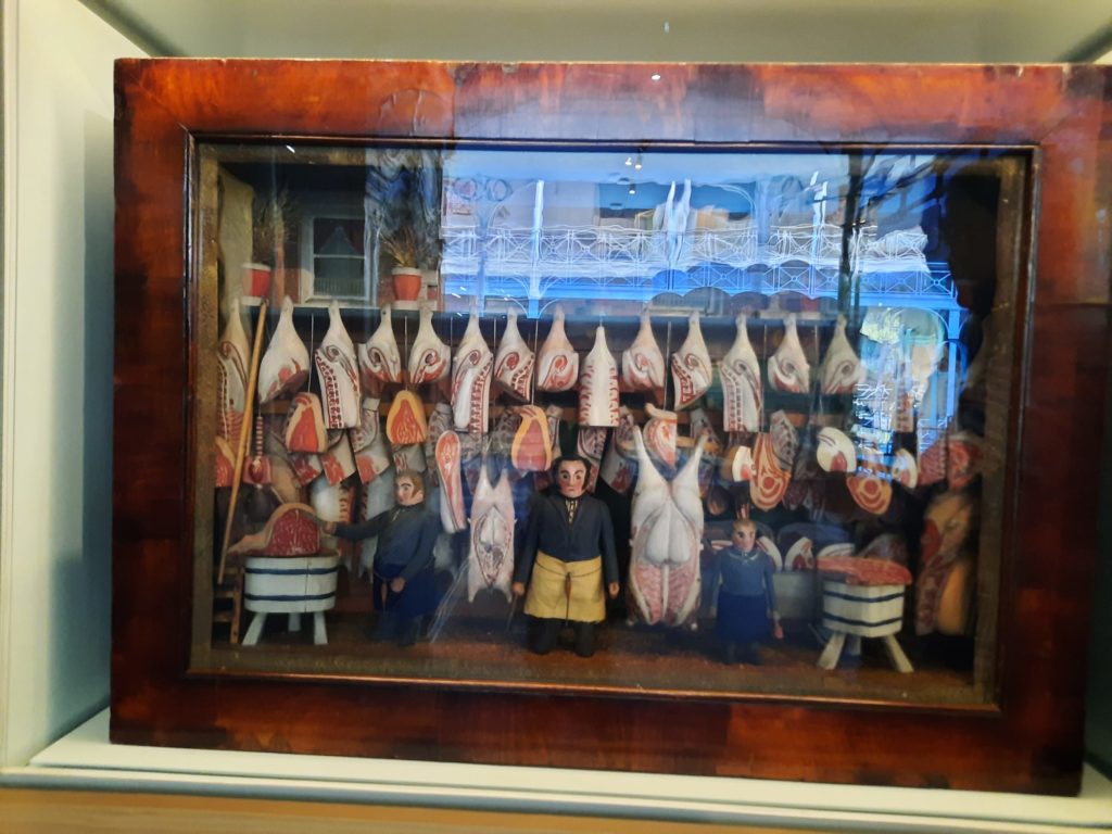
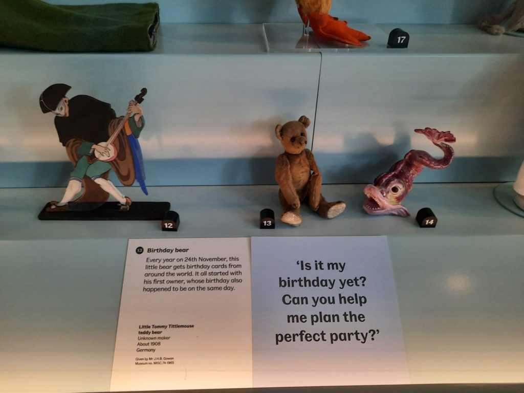
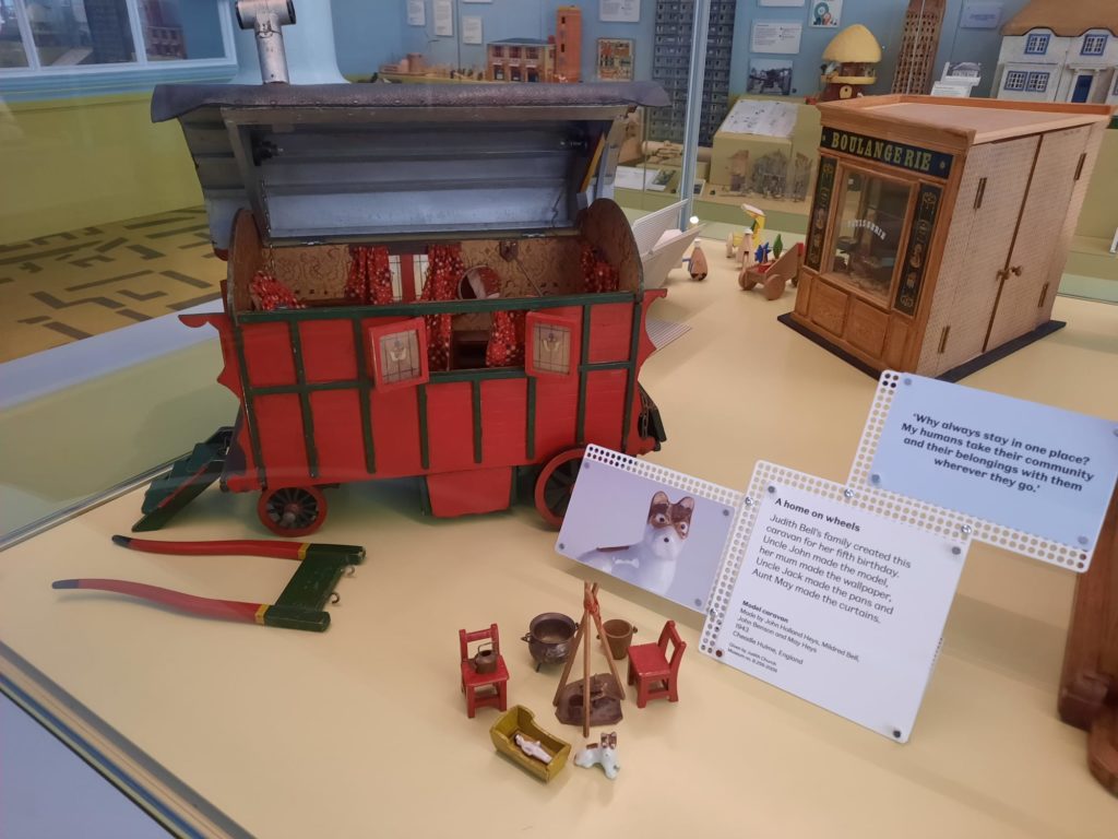
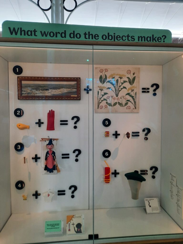
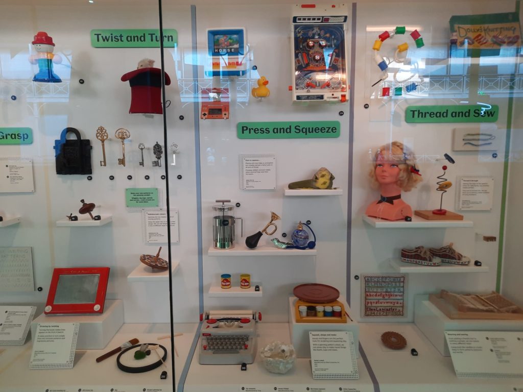
Let’s start where I started my visit, in the ‘Imagine’ space. This one has the highest number of toys from different eras, so is best for those nostalgic about their own childhoods. It’s also organised around a series of questions, intended to get young people thinking creatively and engaging their imaginations. “Who are you going to meet?” “Where are you going to go?” “How are you going to get there?” Under each of the question are a range of objects to start the discussion, centred around the related theme like people or transport or places.
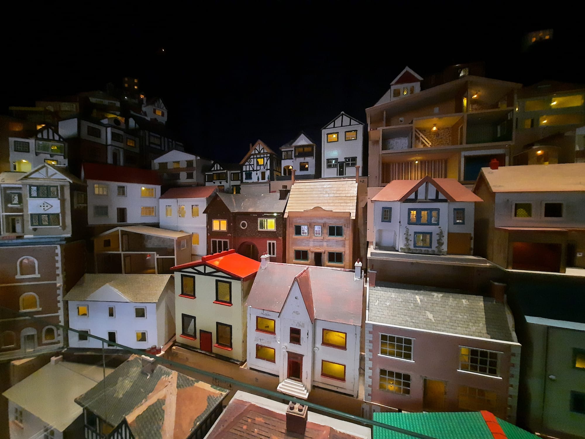
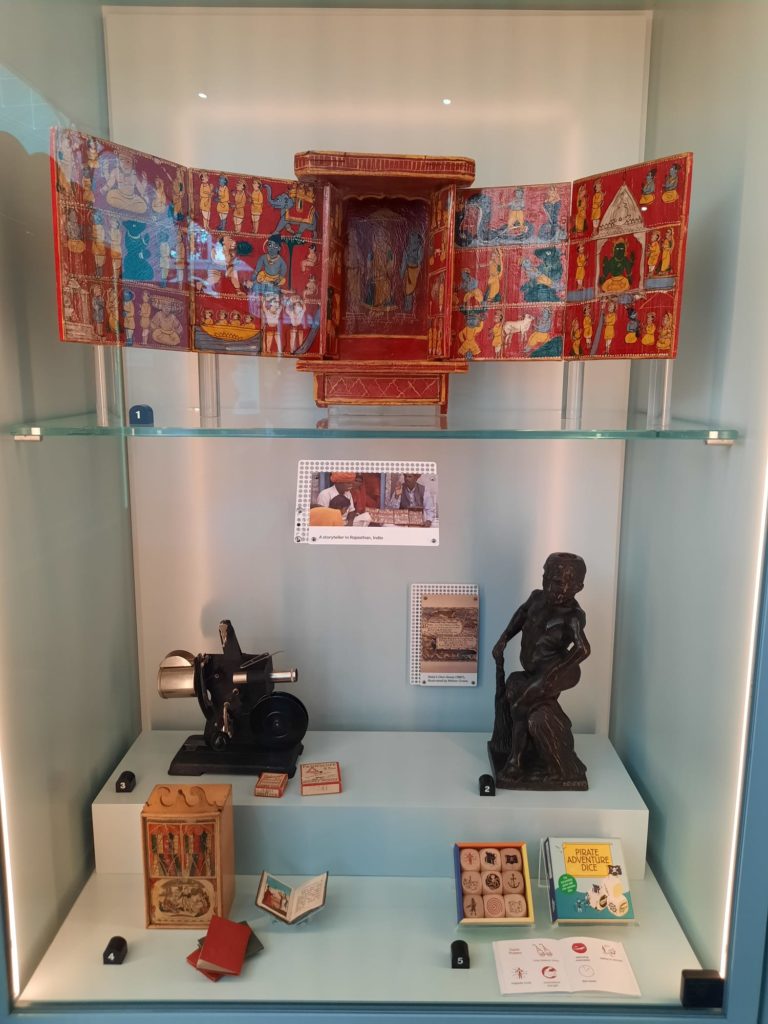
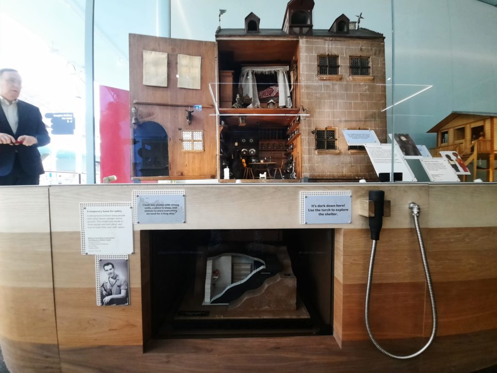
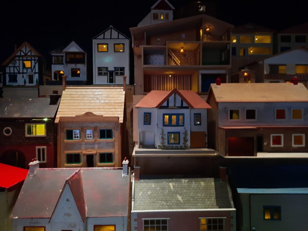
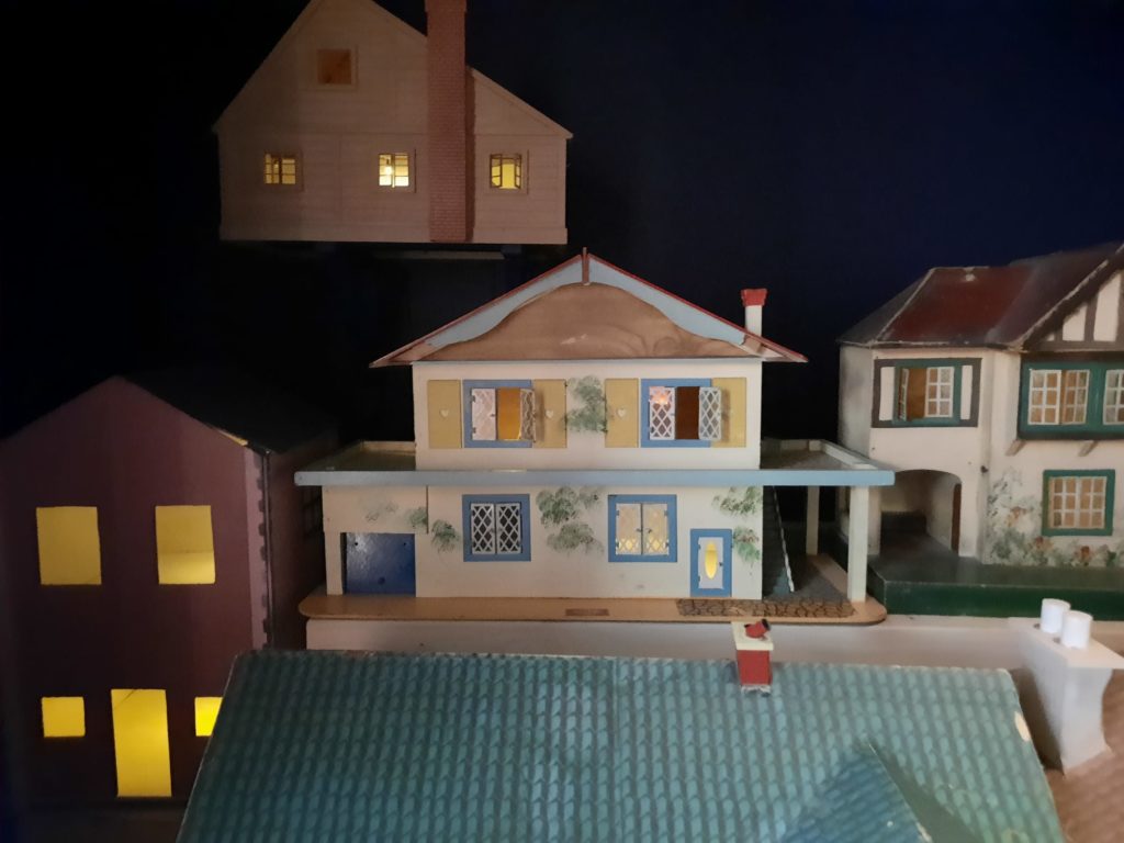
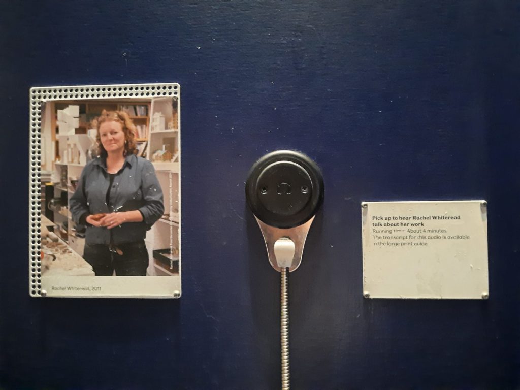
‘Imagine’ is a lot of fun. As well as the vast array of objects there are story-telling machines and a theatre with scheduled creative activities. One area is set up like a street, lined with dollhouses. You can get down and explore basements with a torch. Or listen to a child interviewing Rachel Whiteread about her installation of dozens of dollhouses turned into a hilltop village. It’s a great place to let your inner child loose and get into the spirit of the museum.

‘Design’
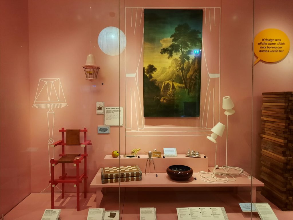
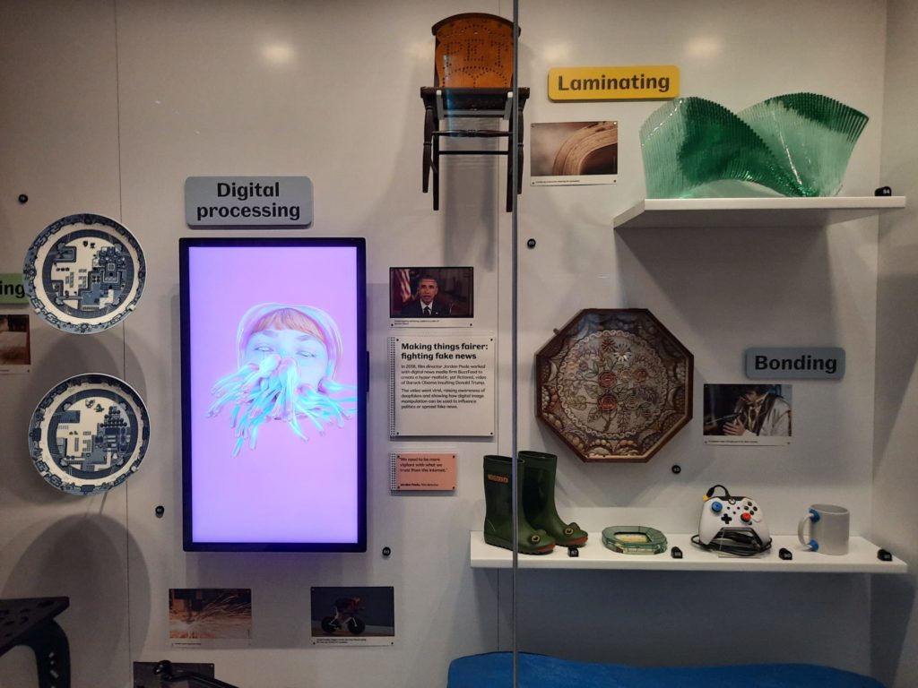
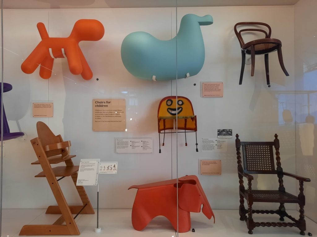
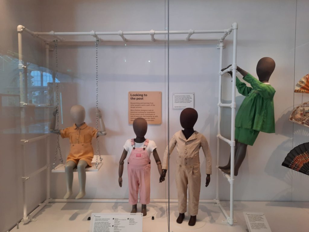
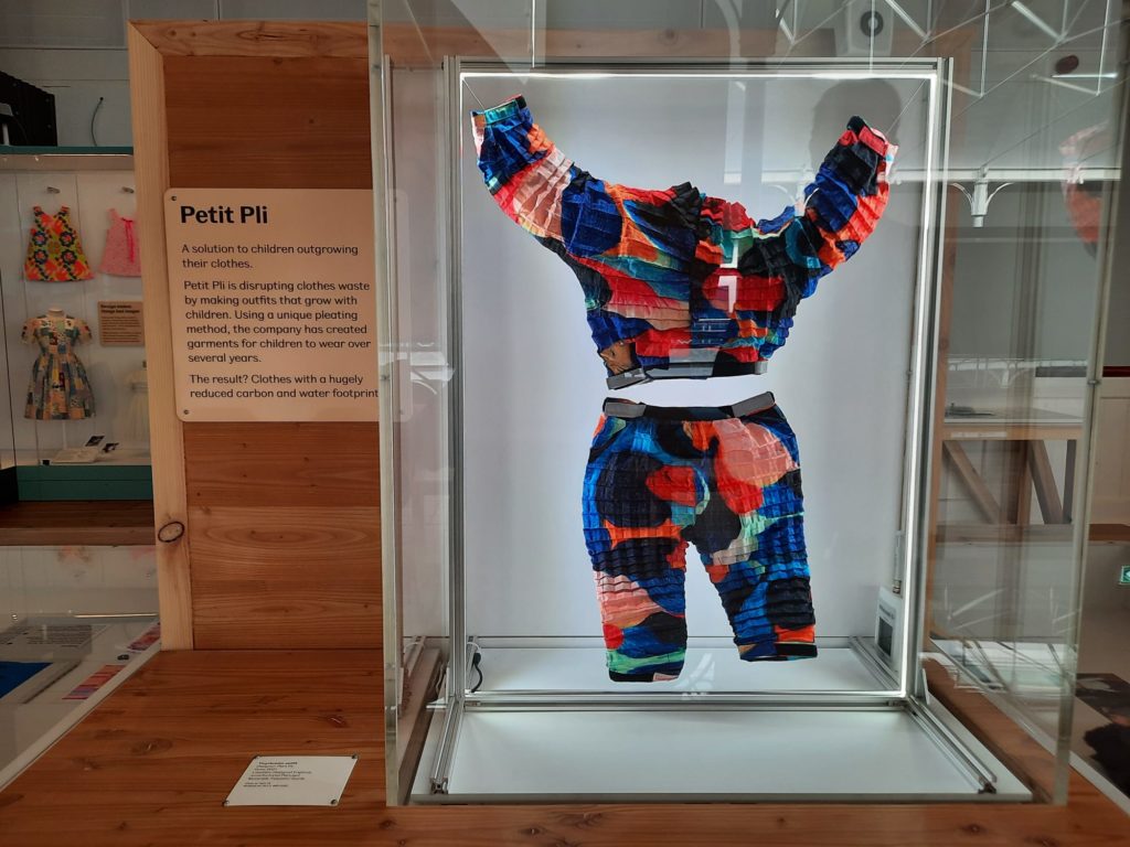
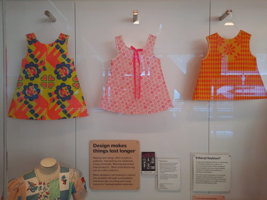
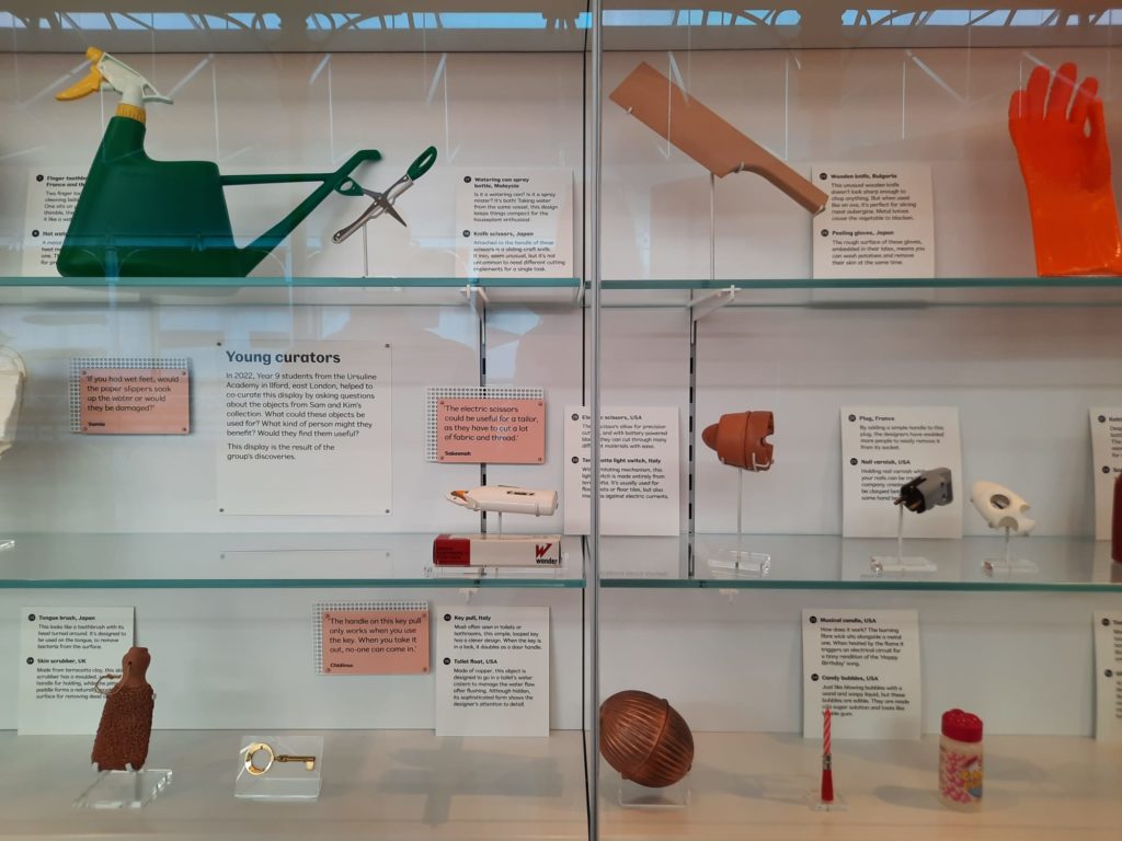
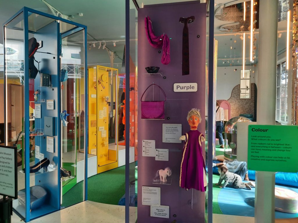
Working our way around the museum, we headed next for ‘Design’ (there was no temporary exhibition on when we visited). This section is all about the design process, breaking it down into simple concepts for young learners. Again objects are often grouped by type (chairs, lamps) to show variation. Different materials, different fashions, different designers: they all have an impact. The children’s fashions are particularly interesting, going from formal to casual, and from hand-stitched to mass produced. Plus one of these outfits by petit pli to show what a step change in design looks like.
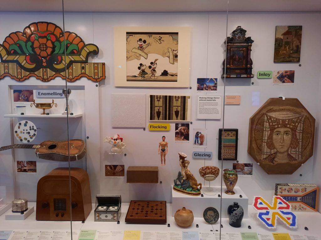
The ‘Design’ section is also about understanding different techniques. There are examples and information on things like lacquer, glazing, bonding, as well as newer technologies like digital design and art. As throughout the museum, the information is conveyed simply but not patronisingly. Although some of the videos will be too complex for visitors on the younger side.
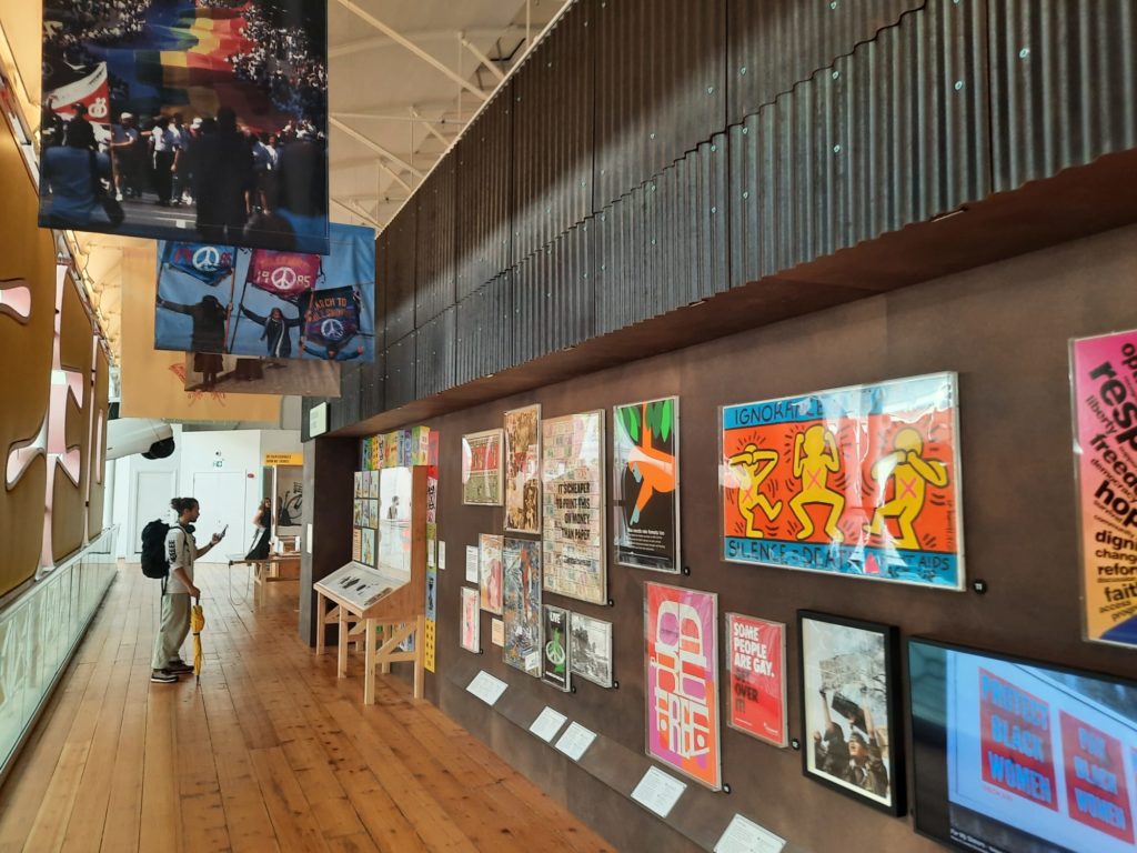
It was up in the ‘Design’ section that I also noticed something interesting, given what I later read about the museum’s reopening. The museum is all about engaging with children and helping them to be creative and confident. This extends even to political engagement, but within limits. “Not everyone’s going to like that!”, I thought, when I saw a display of protest posters on subjects like AIDS, gay rights, and BLM. So I was surprised to read that this display had already been censored by Mr. Hunt. “Some people are gay, get over it!” made the cut. “Some people are trans, get over it!” did not. Museums are political places, perhaps particularly when their Directors are former politicians.


Time To Play
So shaking off thoughts of censorship and politicisation, I headed down to see where all that noise was coming from. Perhaps I should have warned you earlier, but, this being a museum for children, there’s a lot of rambunctious play going on. Plus a sea of buggies to navigate if you want to get down to the toilets. But I digress.
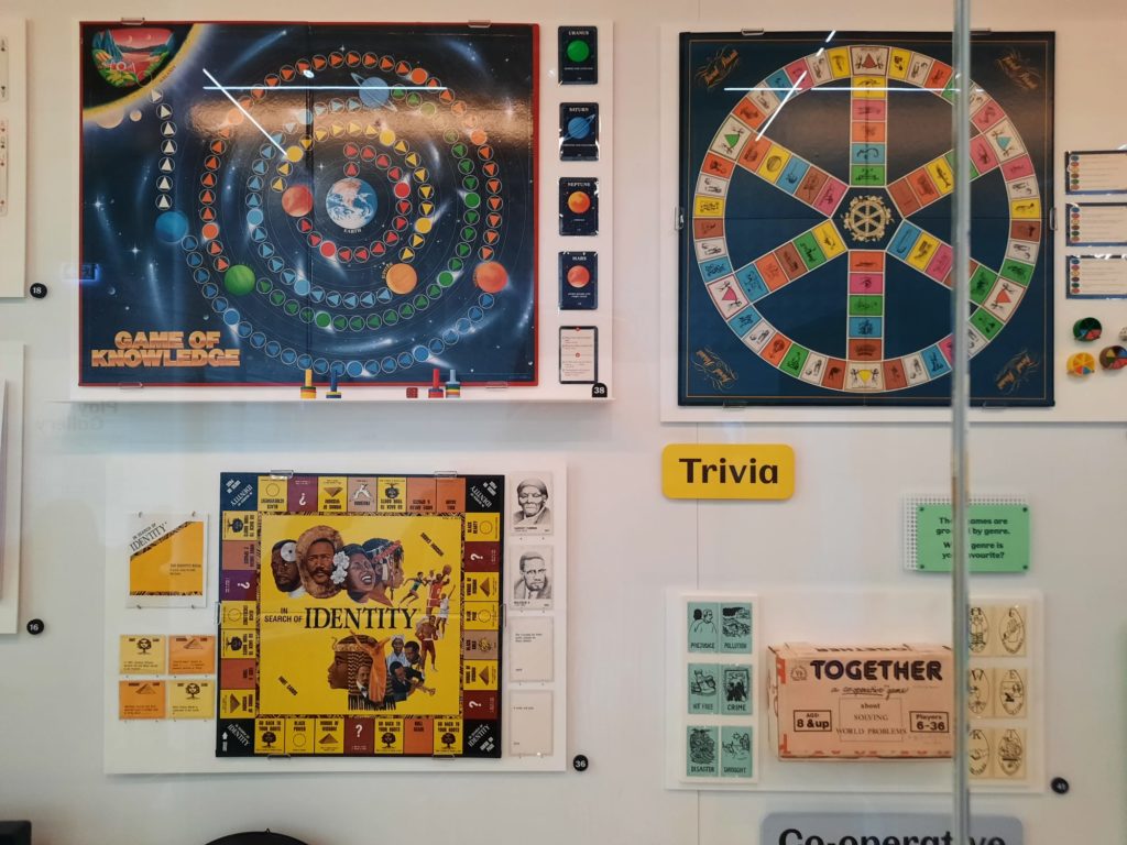
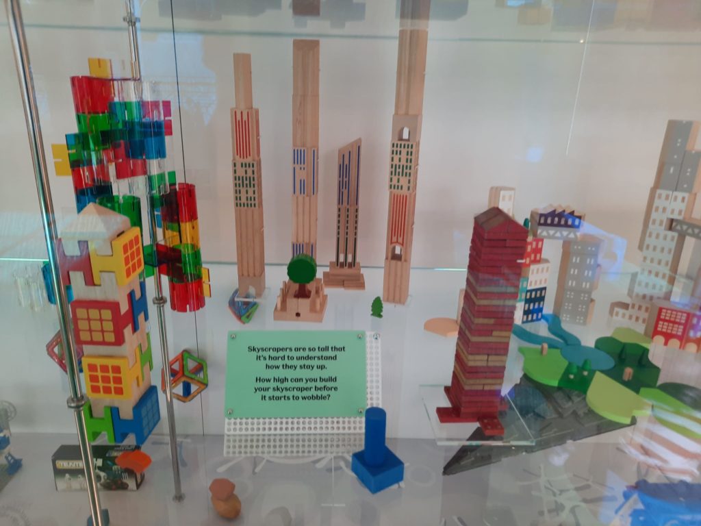
A substantial area of the museum is given over to play. A lot of this is integrated, as we have seen in earlier sections. But below the ‘Design’ section is another devoted to games and toys, which balances displaying them and making them available to youngsters. There is something here for everyone. There are games old and new in vitrines. A ‘make your own game’ activity for mostly older children. You can play with blocks, solve riddles, try out video games, and more. There’s even a dedicated space for the littlest visitors to enjoy some soft play.
Adult visitors without an accompanying child may find themselves a little out of place here, stepping over little arms and legs to get closer to a moonhopper or game of Buckaroo. But this brings me back to the key point here: this is a museum for children, that adults can also choose to visit.
The Visiting Experience
Ok, but as an adult visitor, how is it? Overall I enjoyed Young V&A. I am not a parent so am not used to being around that energy for long periods: sometimes it was a lot. But you have to embrace it, really get into the spirit. Clamber through that little gap, if you dare. Try on a costume. Spin the wheel until your story prompt floats out. Tap into your inner child, in order to get the most out of the museum.
From a practical point of view, there are probably ways to plan your visit if you either want to check out additional timed activities, or want to try to see it during a quieter moment. There is a cafe, for instance, but it was too busy to attempt during my visit.
I would say it’s also best to visit with a companion of some kind (I went with my mother – we had fun). With all those conversation starters, it’s better if you have someone to converse with. And it’s the type of museum that has endless small details to notice and comment on. So best in a pair or small group.


Final Thoughts On Young V&A
Having not been to any of its previous incarnations, I really liked the version of the museum that I visited. I thought it was fun, creative, engaging, and achieved its purpose. It’s the sort of museum a child can grow with, taking something different from it each time as their understanding of the world around them matures.
Like I’ve said once or twice already, it won’t be for everyone. It’s not a toy museum, but it used to be. A toy museum is what some people are looking for. And as the museum engages with the world around it, that point of view will go too far for some and not enough for others. It’s inevitable, but as museums have a role to play in fostering diversity and sustainability, opening up that dialogue is important.
I will return to Young V&A at least once more, because I would like to see how they do temporary exhibitions here. Does the ethos of being for children extend to their temporary programming? I assume so, but am interested to see how that manifests. For the rest, I am glad to have seen it. I probably won’t return frequently, but can see how my inner child responded to it and what a special resource it is for London’s children who can come again and again.
Salterton Arts Review’s rating: 3.5/5
Trending
If you see this after your page is loaded completely, leafletJS files are missing.

