Raise The Roof: Building For Change – RIBA (Royal Institute of British Architects), London
A relatively simple display of artistic commissions, Raise the Roof: Building for Change enables RIBA to confront some of the more problematic aspects of its history as manifested in the decoration of its London headquarters.
RIBA and Colonialism/Imperialism
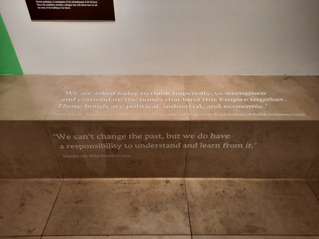
Architecture isn’t neutral. Let’s start there. Buildings serve a functional purpose. They also convey information to us. Information, for example, about what is inside, about the status of the owners or occupants, about the beliefs and values of those involved in its construction. Think, for example, about a museum. Do you imagine a neoclassical building with columns? Walking up stone steps to enter? Even in just this quick example there is a whole set of signs, symbols and messages we could unpack: about a ‘temple’ of art and culture, about what that signifies about what is included or excluded, about who belongs here or doesn’t (and how one should behave inside). So architecture isn’t neutral. It’s actually a fairly political act.
This is a great starting point to understanding the exhibition currently on at RIBA (the Royal Institute of British Architects). In Raise the Roof: Building for Change RIBA reflects on some difficult aspects of its historical and political role. This is achieved through four works commissioned from contemporary artists, which respond to particular elements of the decoration of RIBA’s Portland Place headquarters. The background to this self-scrutiny and dialogue is that RIBA are soon to undertake a project to transform and modernise their 1934 building. But what to do about the most obviously outdated depictions of race, imperialism and gender?
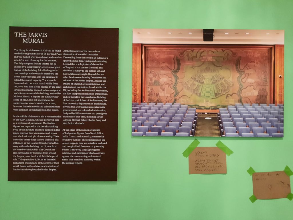
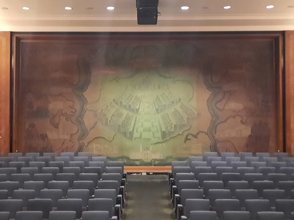
Before we get any further, let’s look at exactly what those problematic decorative elements are. Raise the Roof focuses on two: the Jarvis Mural and the Florence Hall Dominion Screen. The former is a large canvas screen in a lecture hall. The painting, by Edward Bainbridge Copnall, is racist and paternalistic to modern eyes. At the centre: the RIBA Council. Around them: notable buildings linked to colonial rule and Empire (like the Bank of England, Canadian Parliament Buildings, the then Viceroy’s Palace in New Delhi). And at the outskirts: stereotypical depictions of Indigenous peoples, excluded from any active participation in the process and staring on in wonder instead.
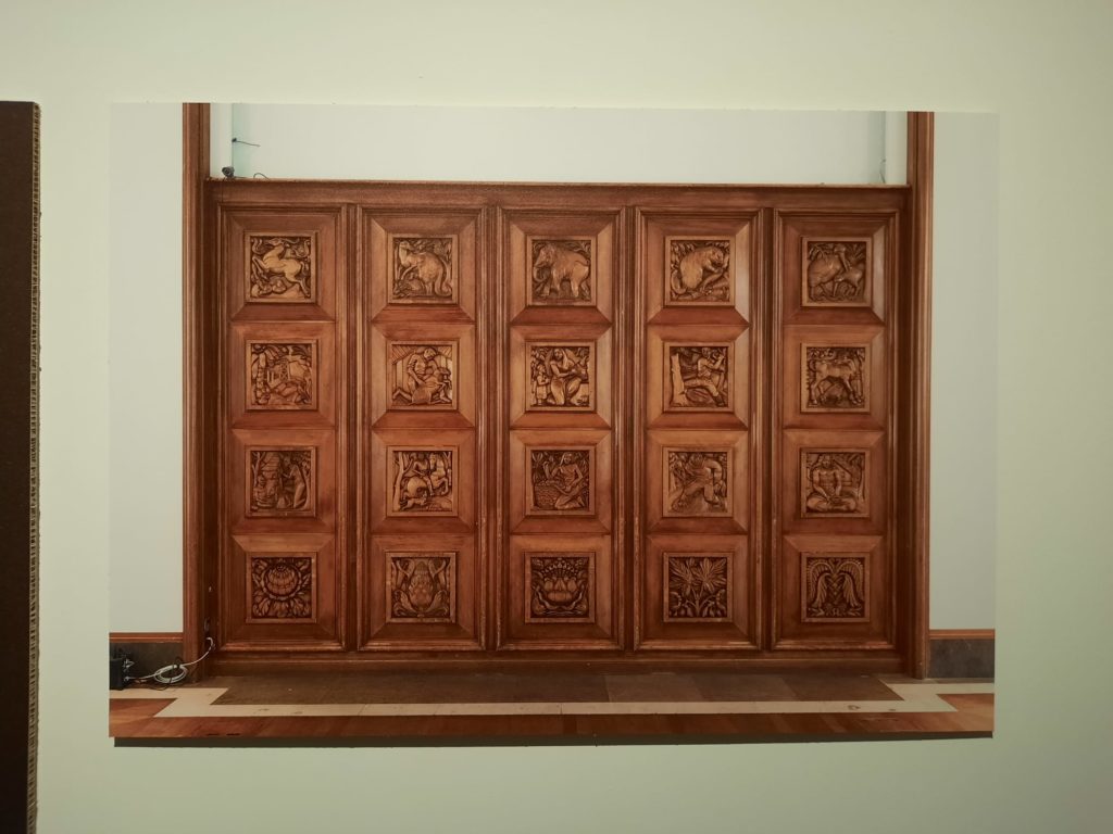
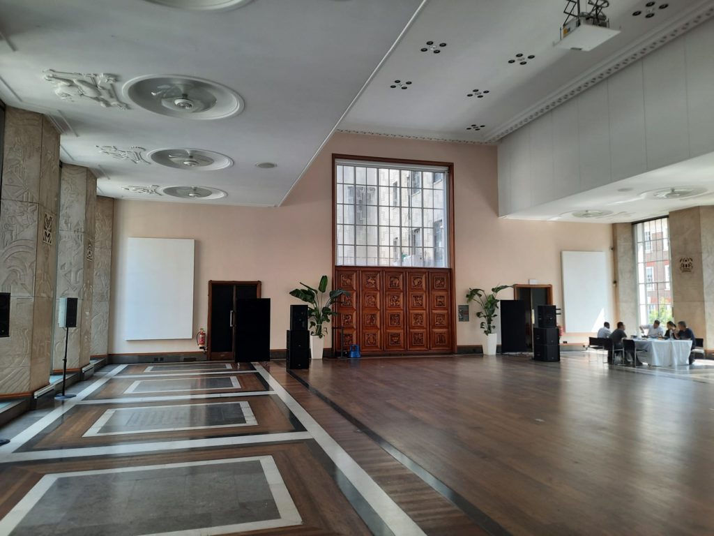
The screen isn’t much better. It’s in an events space, and sculpted in Quebec pine to a design by Denis Dunlop. It represents, as the name suggests, the Dominions (Australia, South Africa, India, Canada, New Zealand). The top and bottom rows show national fauna and flora. The problem are the middle two rows, which, purporting to show industry and agriculture, again in primitivist and paternalistic style.
A resource page here provides interesting further reading.
The Artists Respond
That is the briefest of outlines of the Jarvis Mural and Dominion Screen. If you want more information, I suggest you follow the links above or visit the exhibition! Let’s now look at the artists commissioned to respond, and how they did so.
There are works by four artists as part of Raise the Roof. They are Esi Eshun, Thandi Loewenson (assisted by Zhongshan Zou), Arinjoy Sen, and Giles Tettey Nartey. All are multi-disciplinary, including experience in architectural practice or design for at least three of them. Perhaps ‘creatives’ is a better term for them. Their works are best seen as interventions, challenging the narratives implicit in the mural and screen. And each of them do this in different ways.
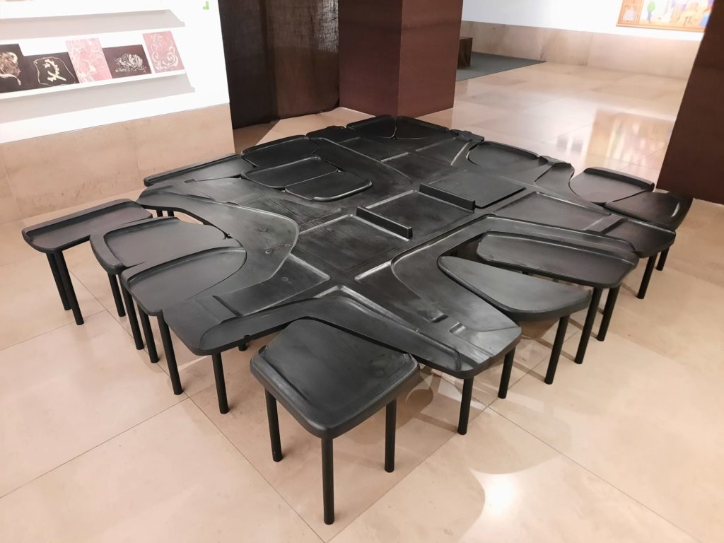
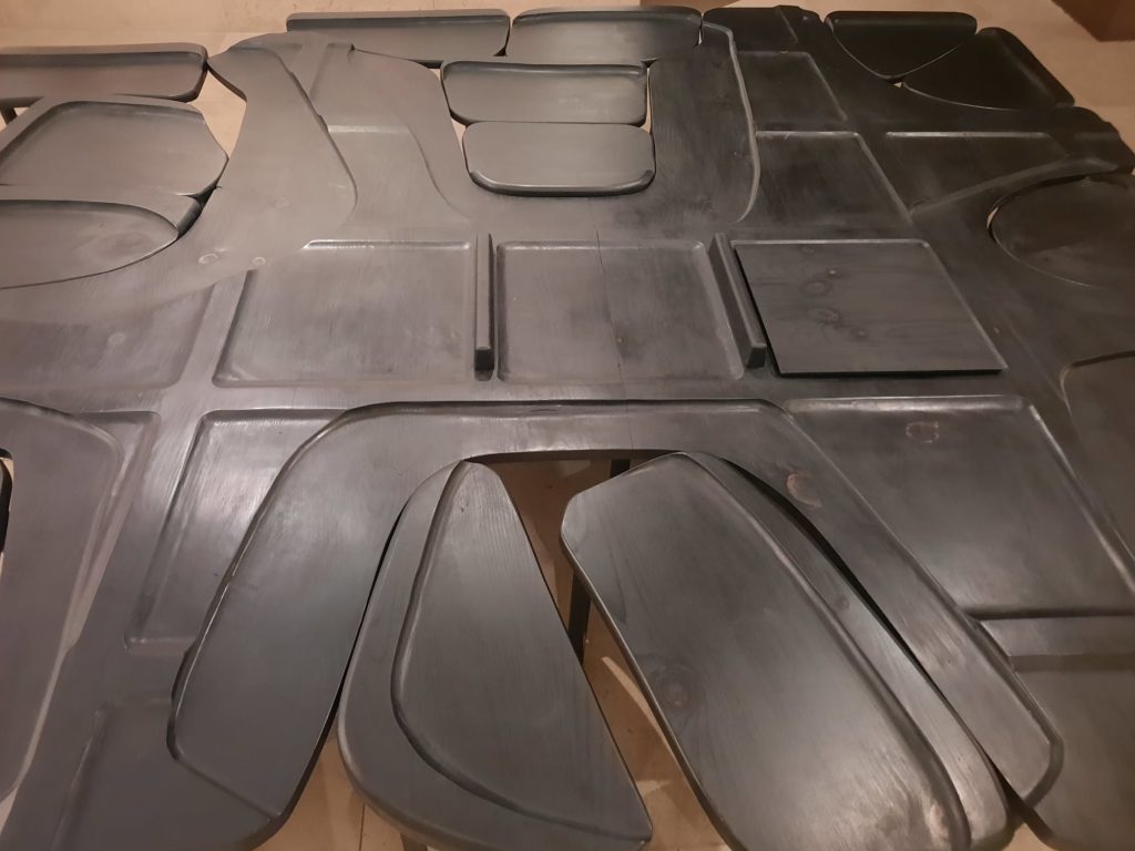
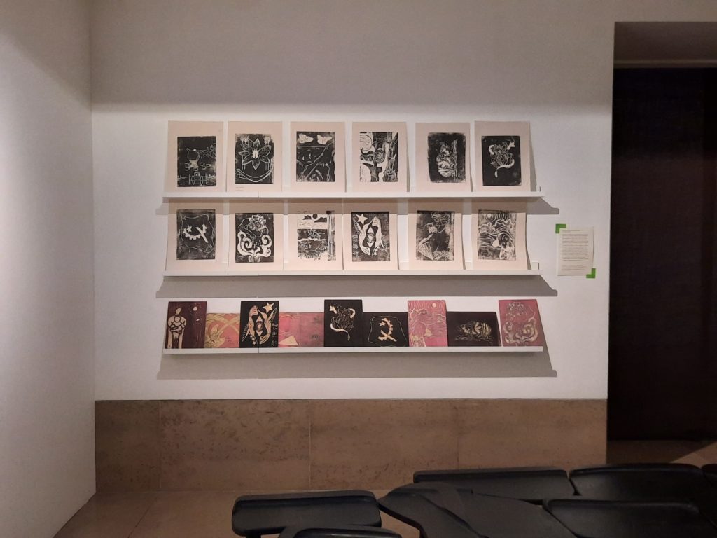
Let’s start with Giles Tettey Nartey. A British-Ghanaian designer, researcher, and architect, he has created Assembly in response to the Dominion Screen. Assembly is made from the same Quebec pine, and echoes the screen’s rows of squares. But its function is very different: a set of stools people can interact with to hold space for conversation and discourse. The outputs of a youth workshop where Assembly was used for its intended purpose are also on display.
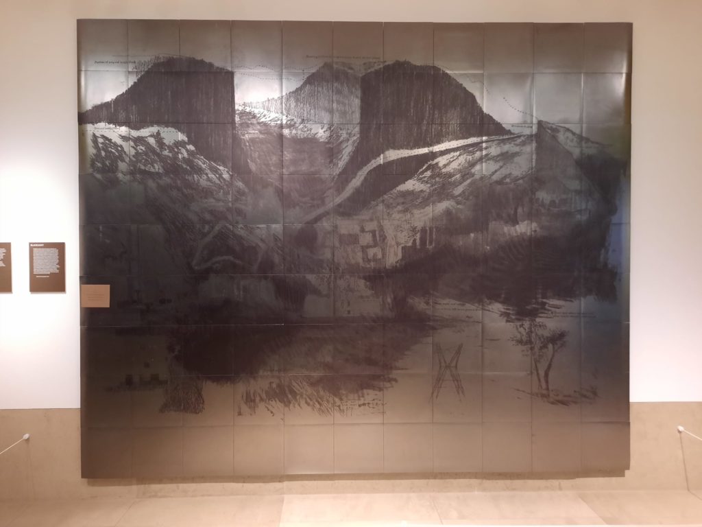
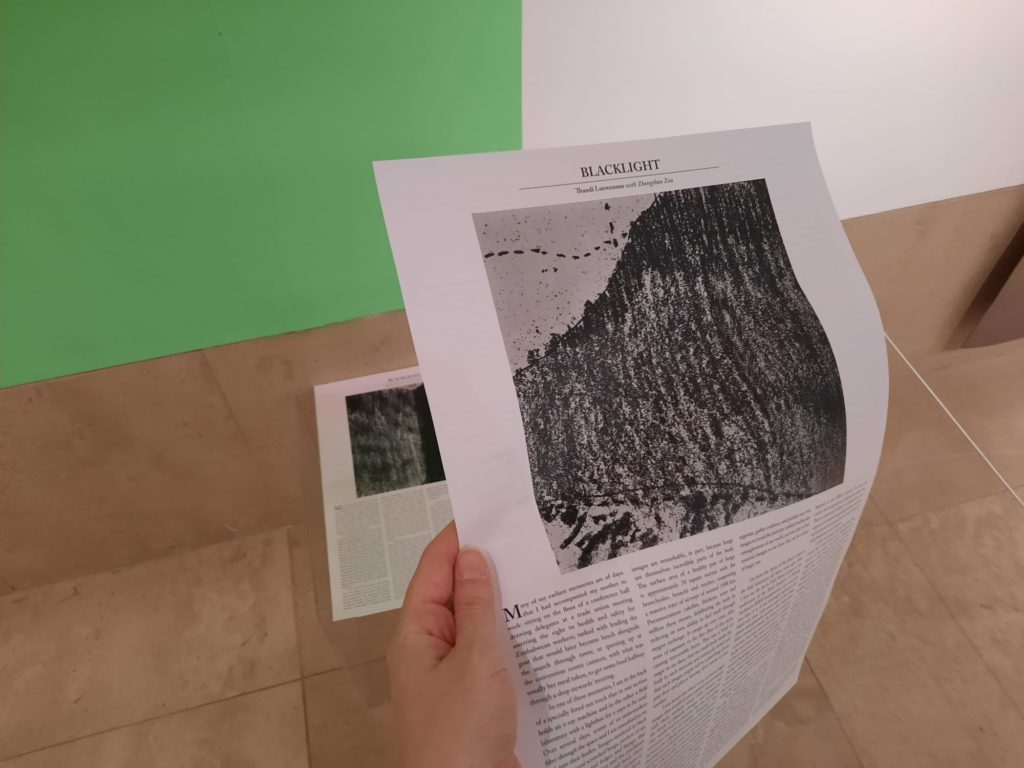
Thandi Loewenson’s Blacklight responds to the racialisation and exploitation inherent in the Jarvis Hall mural. It is a graphite overlay of the mural with an image of Broken Hill in Zambia. Once an important colonial political centre and site of resource extraction, it’s now one of the most toxic places in the world. It’s also where workers discovered a Homo rhodesiensis skull in 1921. Loewenson’s work encourages visitors to think about the legacies of colonialism and the complicities of institutions like RIBA in constructing and replicating it.
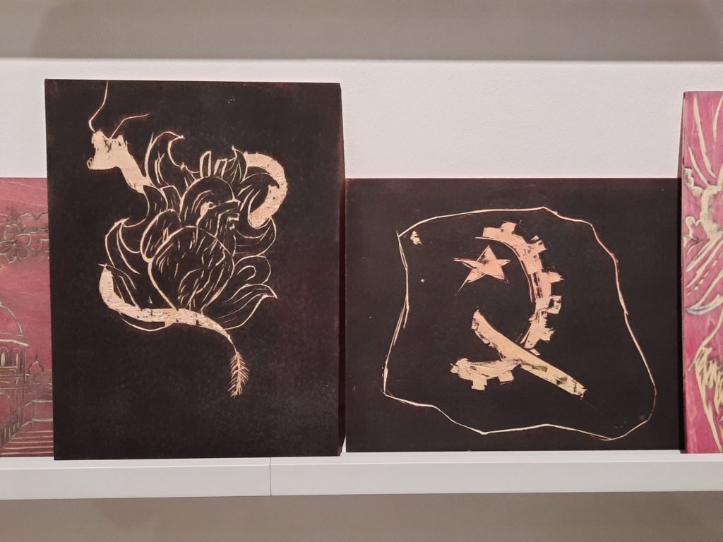
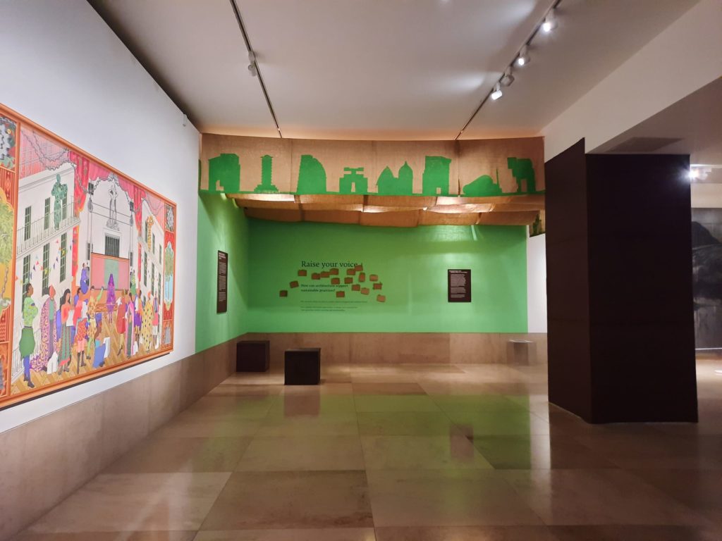
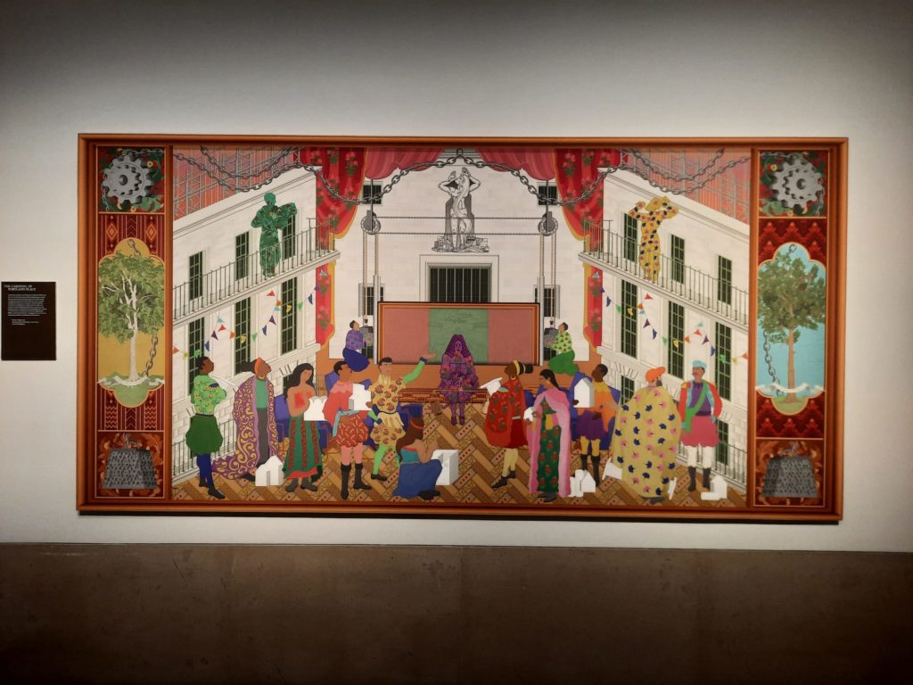
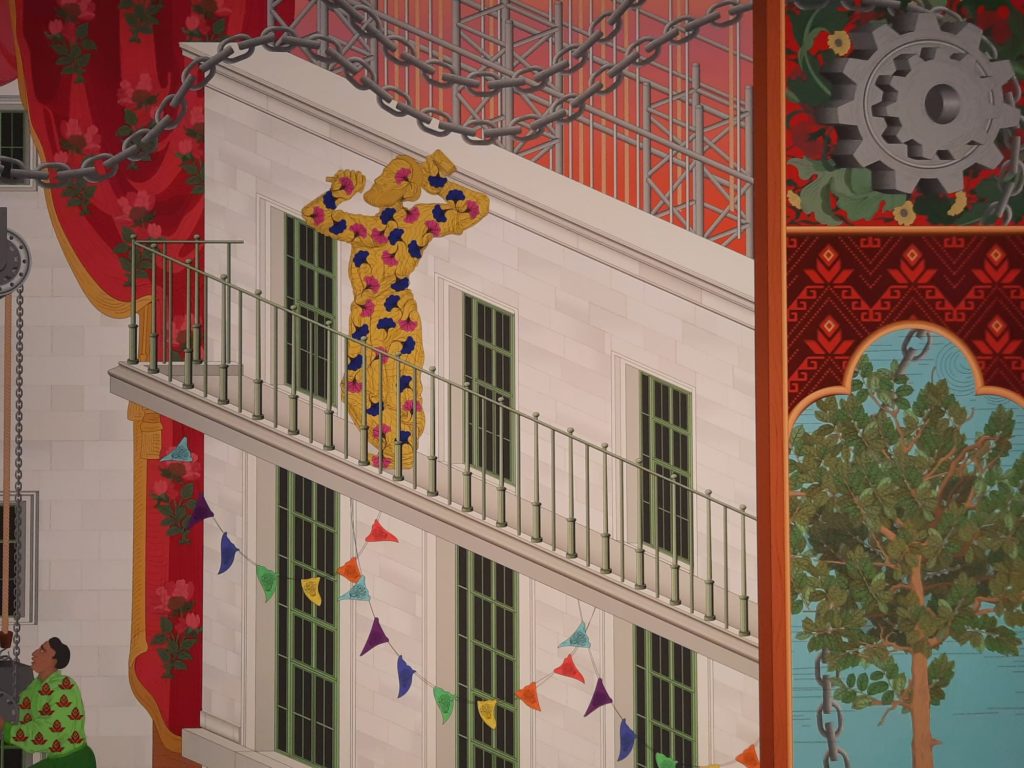
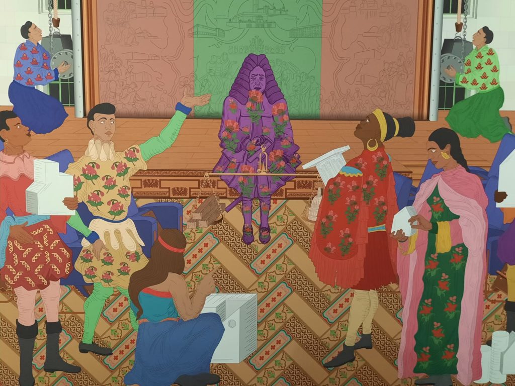
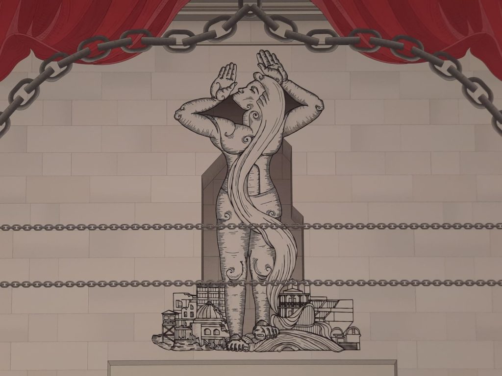
Arinjoy Sen’s The Carnival of Portland Place is a joyful work. The Carnival of Portland Place is another response to the mural. It subverts the scene by turning it into a colourful carnival, bringing different voices to the fore and reimaging architecture as a force for positive futures rather than colonial pasts. Its highly decorated figures reminded me somewhat of Yinka Shonibare‘s work.
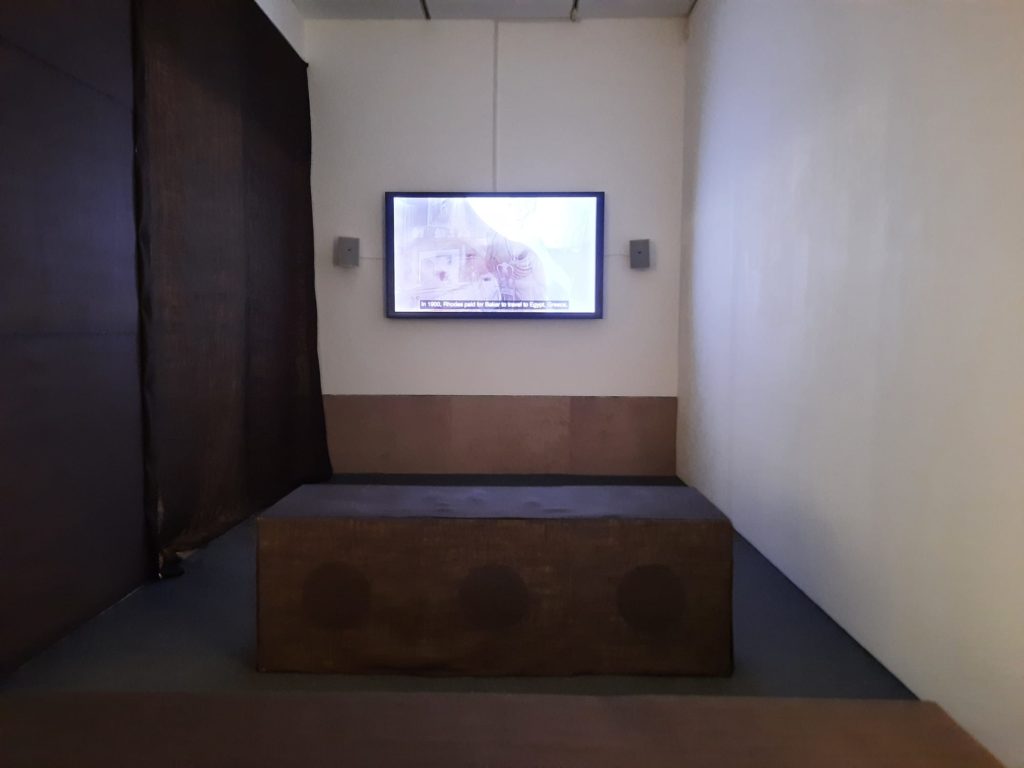
And finally we have The Vanishment, by multidisciplinary artist Esi Eshun. It is a 15 minute video, which goes into the archives to surface stories behind the Jarvis Hall mural. It’s a thoughtful and unflinching work which put into context the other artworks, the mural and screen, and RIBA’s role in Britain’s Empire.
Raise The Roof: Building for Change – Putting It All Together
We’ve seen the four commissioned works now. But what we haven’t seen are the Jarvis Hall mural and Dominion Screen which started us on this journey in the first place. And it’s important to note that most visitors to the exhibition won’t. They are on different floors, in less visitor-friendly spaces, and it’s not practical to guide people there ad hoc. The eagle-eyed amongst you will have spotted the last two photos above, however. I was lucky enough to get just such ad hoc guiding, as a thank you for completing a visitor survey interview. If you don’t get the same opportunity, it looks like RIBA are taking part in this year’s Open House festival so you may get to see them then.
And what did I think of the exhibition? Like Entangled Pasts at the Royal Academy, I love that RIBA are opening up a dialogue about difficult topics. How can they be a leading and forward-looking institution, if some members will look at these decorative elements and see themselves excluded? And having seen the screen and mural for myself now, I don’t believe any artistic merit outweighs that potential harm. It can be tricky when it comes to listed buildings, but RIBA are right to assume that something has to change when they undertake their modernisation project.
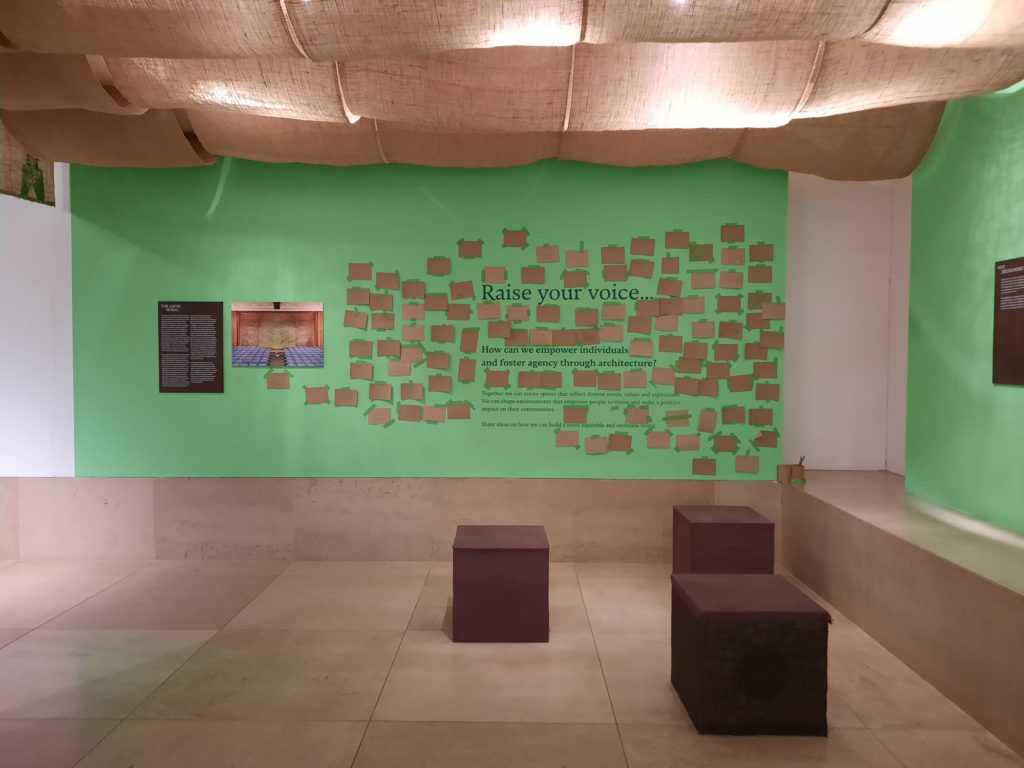
I also liked the exhibition design, and how it supports the conversation. It’s by MSOMA Architects with graphic design studio Plan B. Two spaces hung with hessian and painted a soft green are inspired by traditional Malian toguna shelters. I didn’t recognise all the non-Western architectural influences printed in silhouette as part of the exhibition design, but I did appreciate the broadening of the selection of buildings from the Jarvis Hall mural. And finally Margaret Cubbage’s curation is clear and straightforward. There is a lot of reading to be done, but the self-selecting audience who will visit this exhibition will find the content interesting and engaging.
It was enough to draw me to 66 Portland Place for the first time. I appreciated being able to take an educated and critical look at some facets of this 90 year old Modernist building, and to consider both its history and its future.
Salterton Arts Review’s rating: 3.5/5
Raise the Roof: Building for Change on until 21 September 2024
Trending
If you see this after your page is loaded completely, leafletJS files are missing.

