Michael Craig-Martin – Royal Academy, London
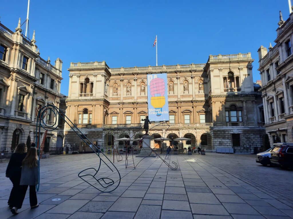
Michael Craig-Martin fills the Royal Academy‘s main galleries with a riot of colour in a full-scale career retrospective.
Sir Michael Craig-Martin, RA
If you’re looking for an exhibition to combat the oncoming gloom of the colder months, this might just be the thing. Sir Michael Craig-Martin, a Royal Academician known for his brightly coloured paintings of daily objects, takes over the RA’s main galleries in a career retrospective spanning six decades. I tend to love exhibitions of big, bold artworks in this space. So I was hopeful this would fit the bill.
Let’s start with a brief introduction to Craig-Martin though, shall we? Born in Dublin in 1941, his upbringing was rather international. His father was an economist at the World Bank, and the young Craig-Martin grew up mostly in the US, with a stint in Colombia where he studied at the Lycée Français (French High School). A Catholic education seems to have fostered an early interest in art, and Craig-Martin took up painting while studying English Literature and History at Fordham University in New York.
His subsequent art education was also international. Craig-Martin studied at the Académie de la Grande Chaumière in Paris in 1961, followed by a painting course at Yale. The teaching at Yale was still strongly influenced by Josef Albers, meaning minimalism and multi-disciplinary experimentation.
In the mid-1960s Michael Craig-Martin moved to London, where he has lived and worked ever since. He taught art alongside his own practice, and was an influence on the YBA generation at Goldsmiths College in the 1980s. He has a daughter, Jessica, who is a photographer, with former wife Jann Hashey. Craig-Martin received a knighthood in 2016, and has been a Royal Academician since 2006. In that sense, this exhibition has been a long time coming.

Early Work: from Minimalism to Line Drawings
I thought that biographical introduction might be helpful because a) although I recognised Craig-Martin’s work prior to this exhibition I didn’t know much about his life and practice and thought maybe you didn’t either and b) knowing about his American upbringing explains why an Irish-born artist is in such dialogue with the US art scene of the 1960s and 70s.
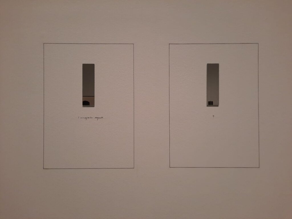
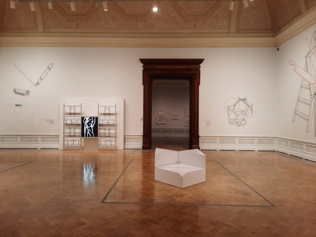
And as the exhibition is chronological, we start there. The first room contains some of Michael Craig-Martin’s early work. For anyone familiar with his brightly coloured later paintings, it’s a bit of a surprise. These early works are understated, minimalist. Conceptual. His most iconic work of these early years is here: An Oak Tree (1973). This work appears to be a glass of water set up on a high shelf. The accompanying text in the style of an interview informs us, however, that the artist has transformed it into an oak tree. It’s philosphical, like Duchamps’ ready-mades, with just a hint of Catholic transubstantiation. An intriguing start.
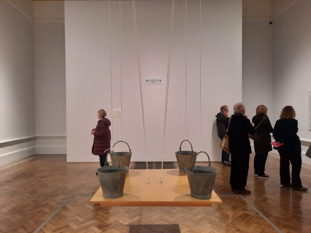
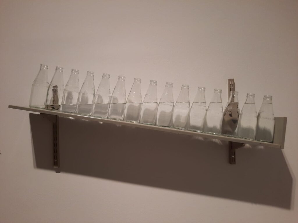
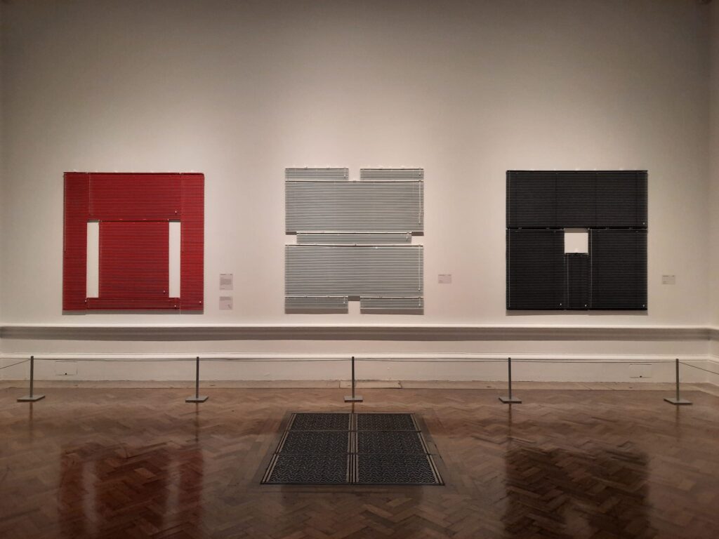
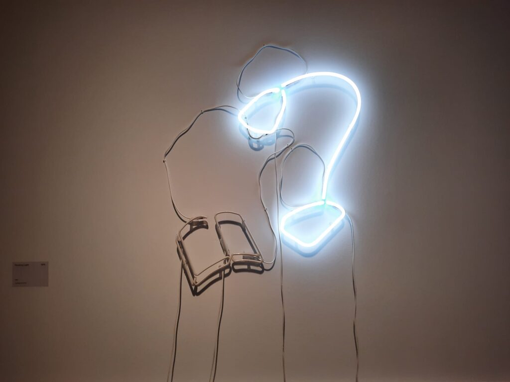
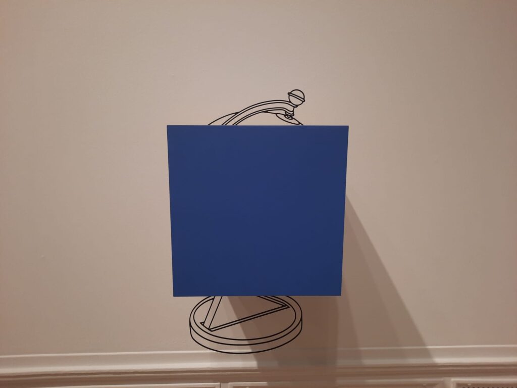
Other works in this room follow suit. There are buckets holding up a table rather than the other way around, bottles leaning violently yet maintaining a perfectly level line of water. But the text informs us that, as far as Craig-Martin was concerned, he couldn’t top An Oak Tree in terms of conceptual art, and so moved on to other things. We do too, with ready-mades, neon and venetian blinds taking the place of paintings in the second room. It really connects with and riffs on the slightly earlier Abstract Expressionists.
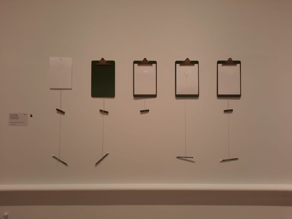
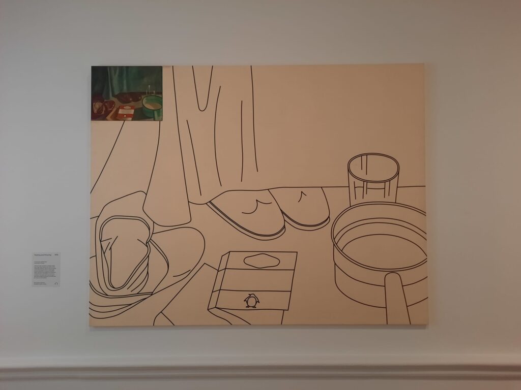
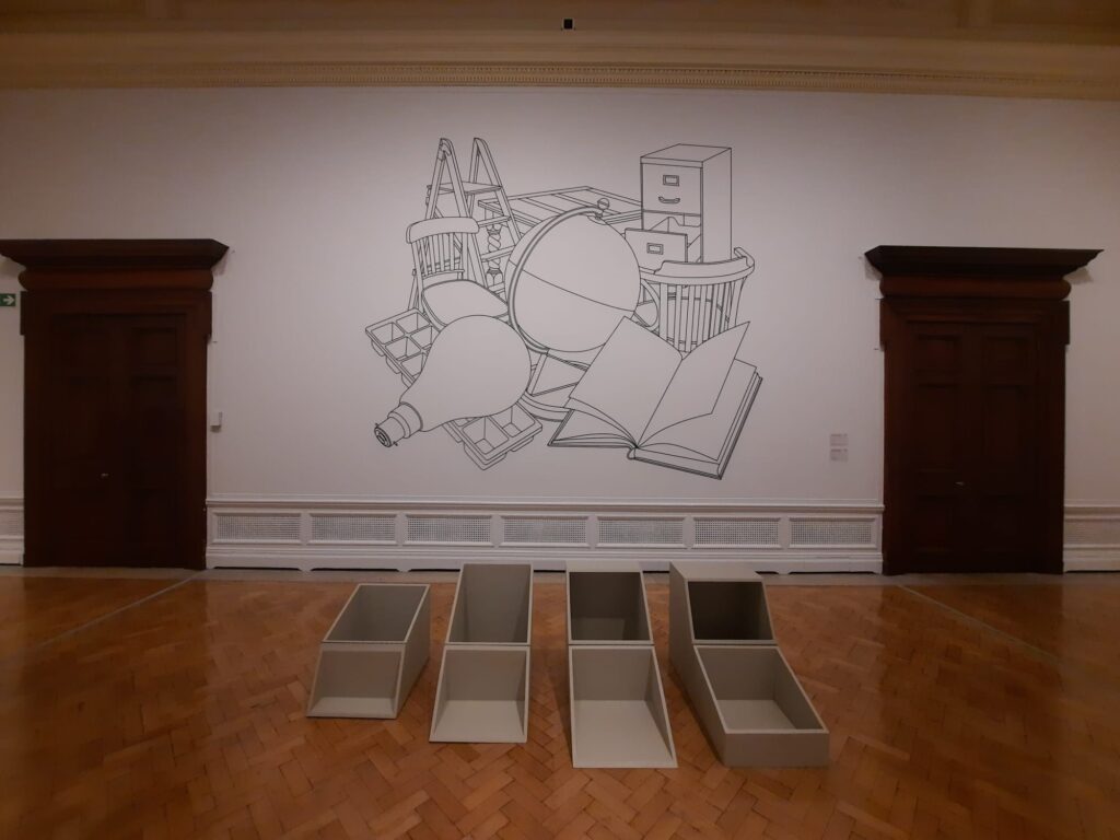
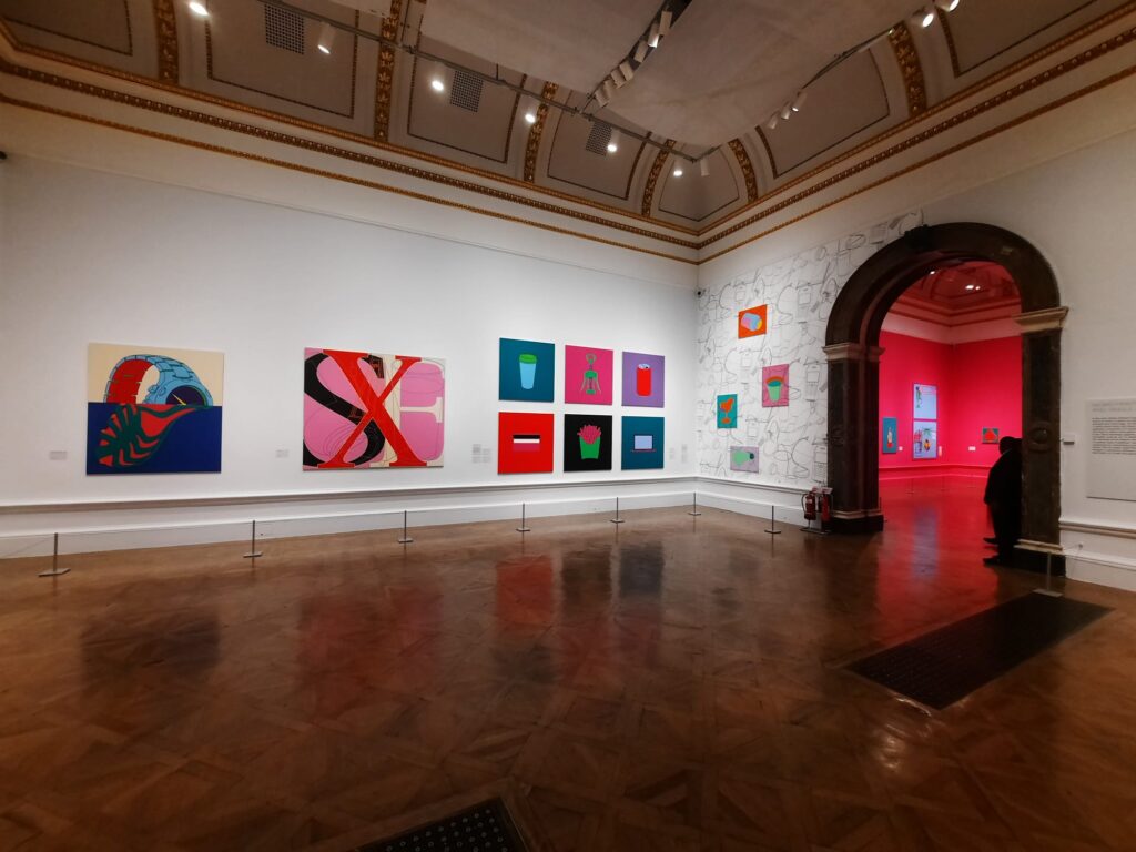
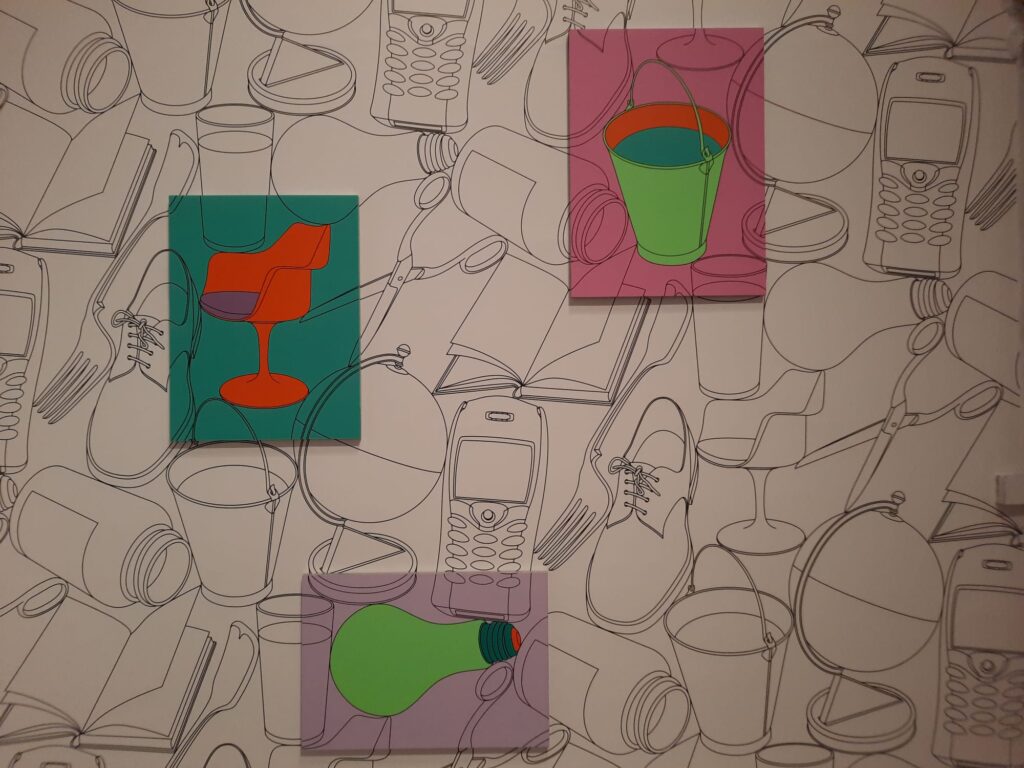
In the third and fourth rooms, Craig-Martin’s style is already becoming more recognisably his own. Drawing and line have always been key features of his artistic practice. One breakthrough came when he realised he could ‘draw’ using tape, achieving thus an unmatched precision and clarity. In these rooms we see ideas on paper turn into large-scale drawings applied to the gallery walls. We also see some of Craig-Martin’s motifs of everyday objects start to appear.
A Riot of Colour
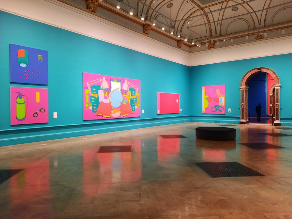
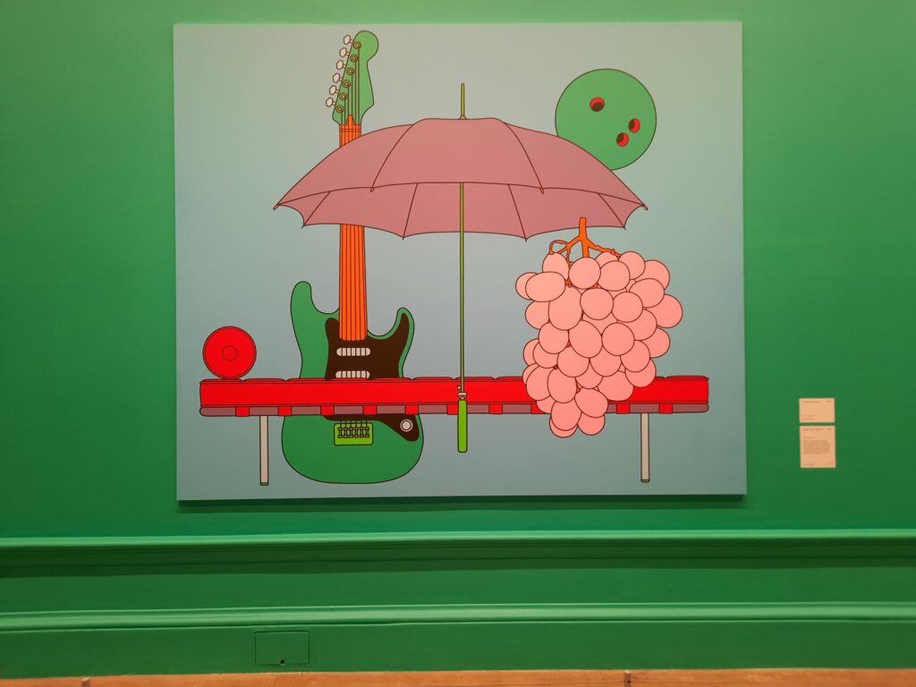
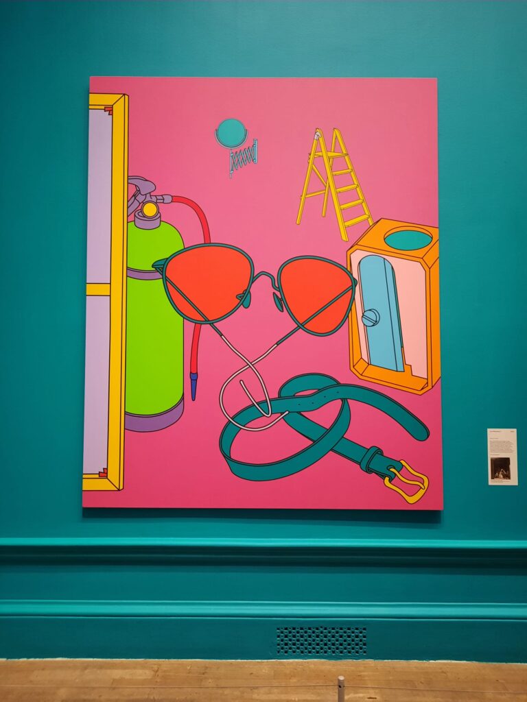
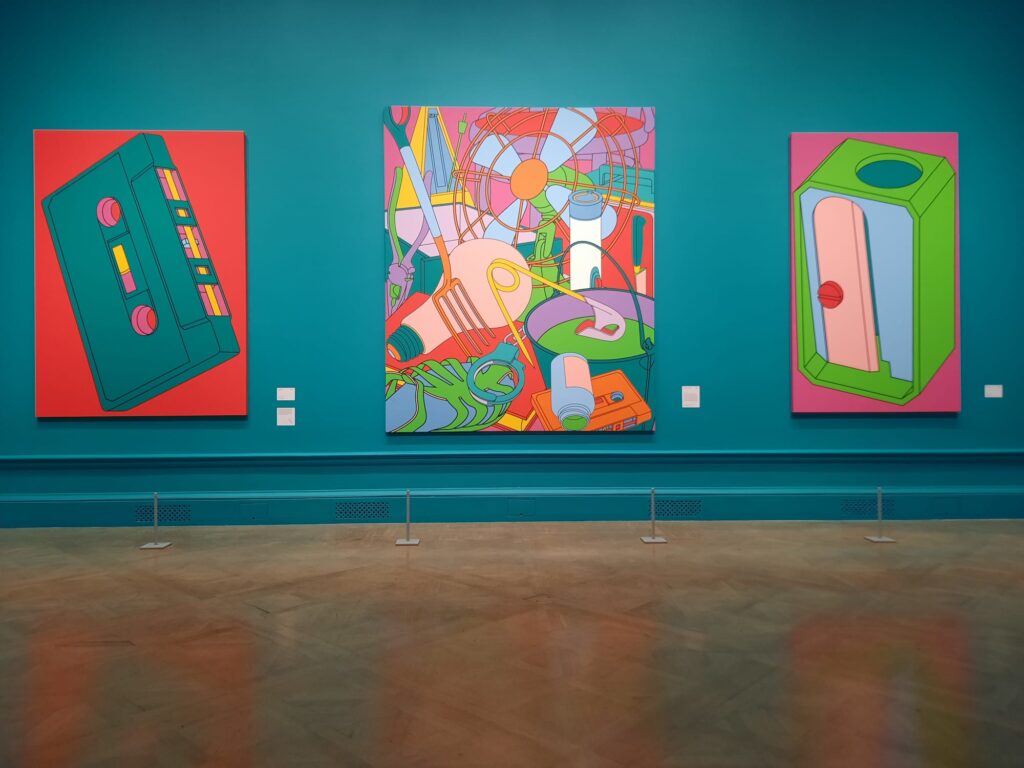
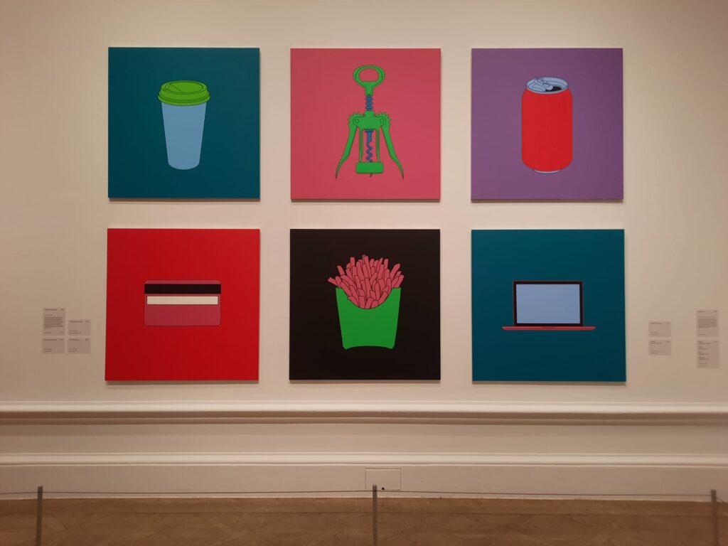
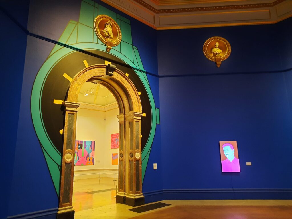
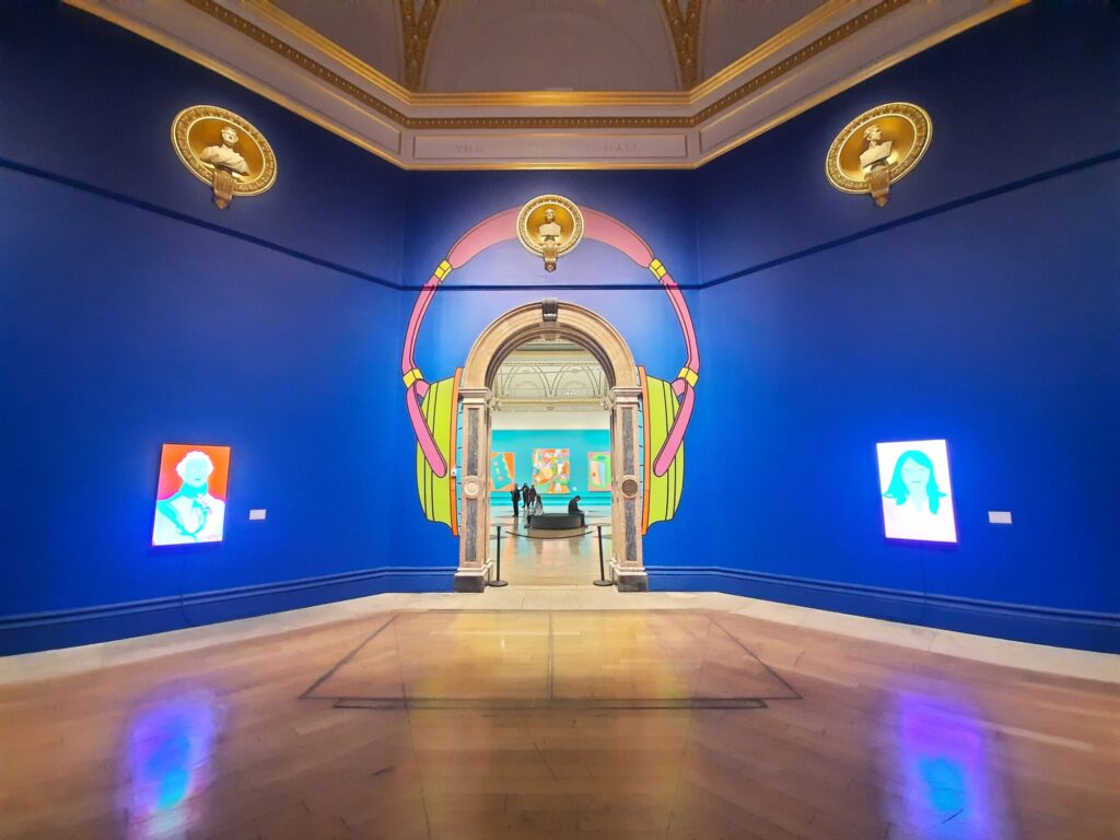
Passing through into the central gallery is an impressive moment. Not only has colour arrived in Craig-Martin’s work, it also adorns the Royal Academy’s walls. Bright and bold, detached from reality, it assaults our senses.
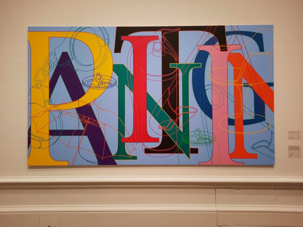
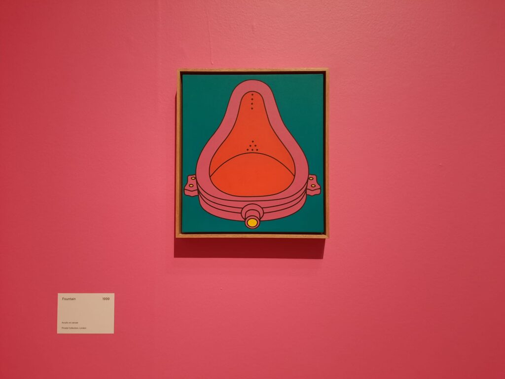
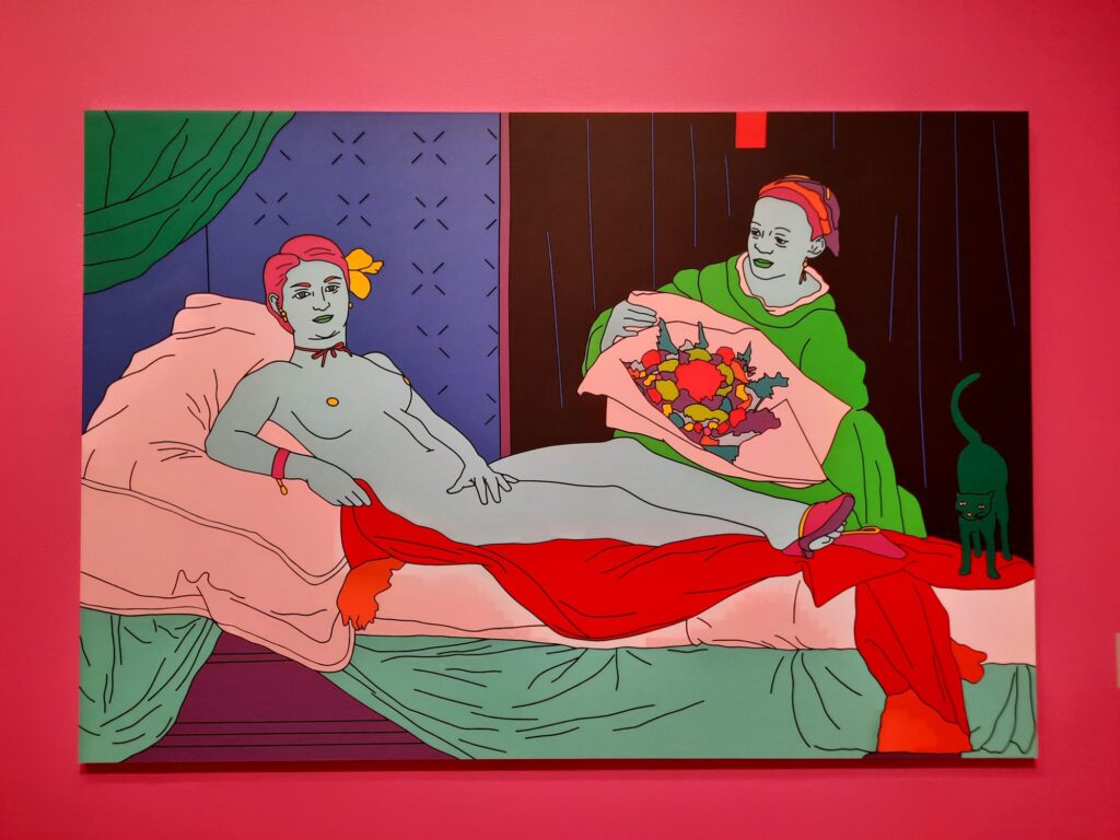
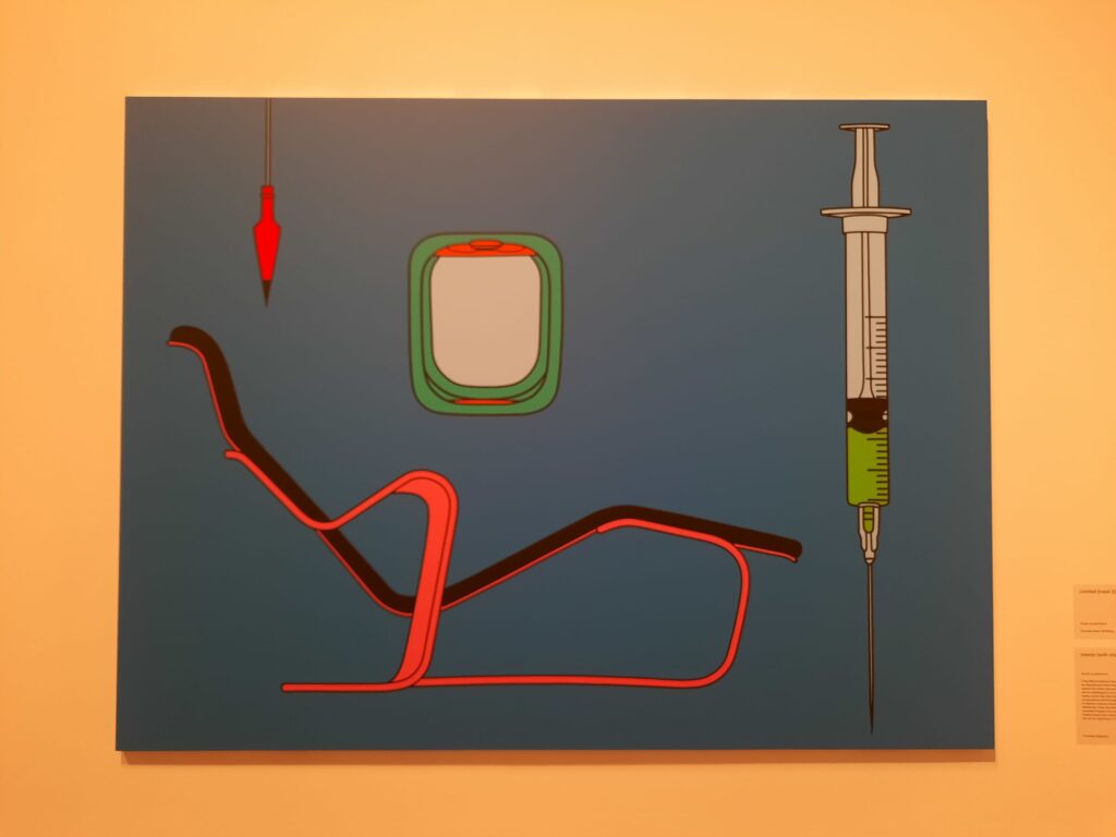
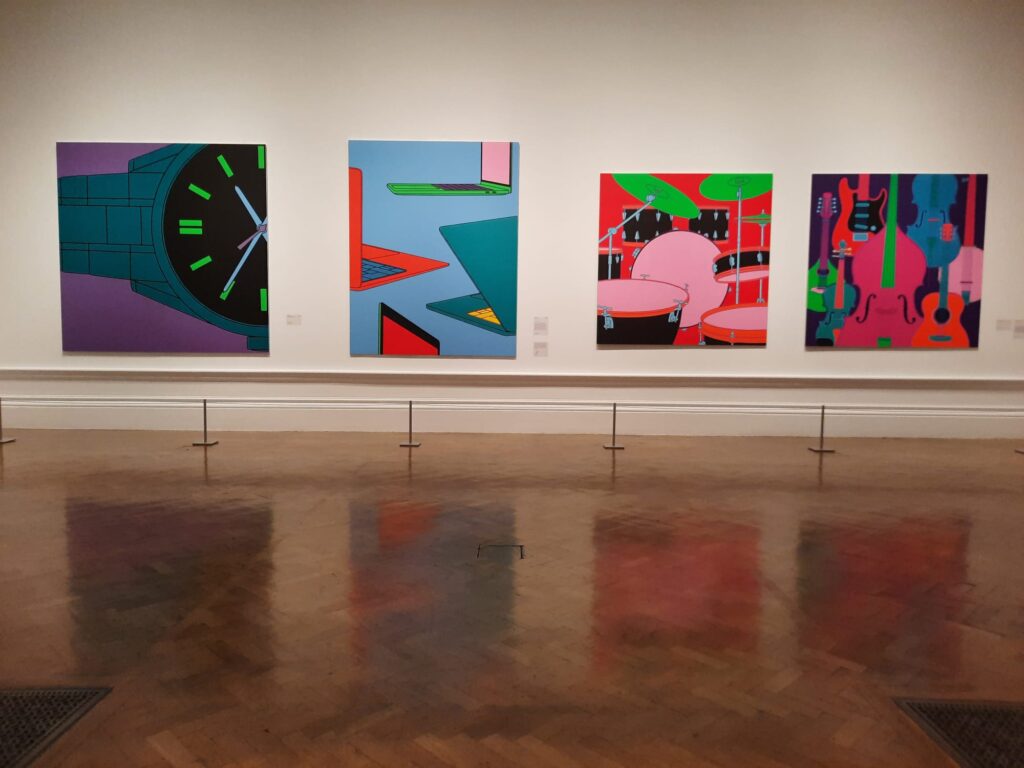
In this first room, however, the elements are familiar if the lurid hues are new. Certain objects appear again and again in Craig-Martin’s works like talismans. Or a language – he has actually created an alphabet of objects not necessarily corresponding to their letter (an umbrella as ‘A’ for instance). We were first introduced to them in the preceding rooms, and now encounter them in full Technicolour glory. It’s like Dorothy stepping out of Kansas and into Oz.
The hang is broadly but not strictly chronological, so we have also been introduced by this point to Craig-Martin’s interest in the changing meaning of objects. An earlier series of line drawings overlaid filing cabinet and memory stick, rotary phone and iPhone, for instance. Seeing works from different decades hung side by side here we have that sense of passing time and obsolescence. Despite their unreal colours, some objects look contemporary while others already start to look dated. It inevitably makes us think of consumer culture: ever-faster product cycles and the mountains of trash we leave behind us.
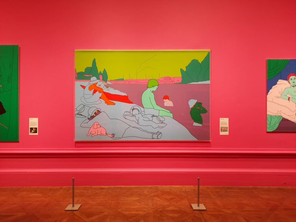
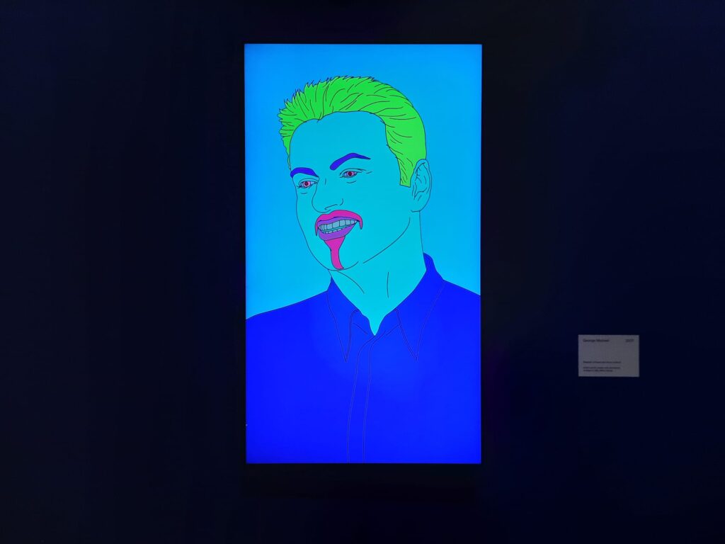
If this visual vernacular becomes a constant thread through the rest of the exhibition, so does experimentation. The colours are here to stay from this point. But they are applied to ‘word paintings’, works from the art historical canon, and famous faces. They come together in different configurations, bounce around the walls of a room in digital form, and are scaled up for a final surprise before exiting. If you weren’t familiar with Michael Craig-Martin’s signature style before you got here, you will be by the time you leave.

Getting to Know You
I feel a little torn about this exhibition. On the one hand, the colours, when they appear, are glorious. You can almost bask in them without taking in the detail of the works themselves. On the other hand, you can almost bask in the colours without taking in the detail of the works themselves. What I mean by this is: the first rooms with the conceptual art are very interesting and could maybe do with a bit more space. The latter rooms are so visually overwhelming that you almost don’t have time to realise that they’re all a bit the same.
And when you get past the colours, what do they really say? Craig-Martin famously doesn’t go in much for heavy-handed art historical interpretations:
“I dislike jargon immensely and cannot stand people who think that complex ideas need to be expressed in a way that is obscure or rarified.”
Edited extracts from ‘On Being an Artist’ by Michael Craig-Martin, printed in exhibition handout
“Artists uniquely expose their true position through their work. If you know my work, I believe you already know me.”
So what do we know about Michael Craig-Martin through his art? Firstly I think we can say that minimalism is a thread in his career even when belied by maximalist colours. His line drawings, his block colours, all reduce objects, artworks and people to their essentials Not Minimalism with a capital M/in an art historical sense, perhaps, but definitely minimalist nonetheless.
Secondly, the clarity of line drawing and Craig-Martin’s long-term use of it allow him to explore longer-term trends. The shift from ‘form follows function’ to a new world of digital objects, for instance. But there is no value judgement here: we can all see that a rotary telephone is a more interesting shape than an iPhone. Craig-Martin gives both equal weight, and merely observes the evolution of one into the other. It follows the artist’s view of artworks as initiators of, rather than embodiments of, ideas.
Final Thoughts on Michael Craig-Martin at the RA
And thirdly, again going back to his start in Conceptual Art, the viewer is an important ingredient of Michael Craig-Martin’s work. It’s not just the artist and the artwork, with an official meaning to be interpreted. The viewer plays an active role in this interpretation. And Craig-Martin understands that viewers will have their own associations, expectations and preconceptions coming into a gallery. His use of (more or less) universally-recognisable objects, people and artworks then becomes more interesting again: these are artefacts with the greatest possible number of ideas, memories and feelings attached to them, with which viewers can participate in the artist’s pursuit of meaning-making.
But we’re getting a bit lofty here, I would probably be told off by Craig-Martin himself if he read this. My point, I think, is that your take on this exhibition might depend on which angle you want to take. At face value, it’s a nice career retrospective, although I would have liked a little more of the early work. Once you start to get into what art means to Craig-Martin and the role he intends us to play, the smaller early section starts to look more like a preamble before letting us loose on the main event.
Either way, I rather enjoyed it. If you’ve seen mixed reviews, don’t pay too much attention. I thought this was a fun, visually stimulating exhibition which gives you a good grounding in an artist’s background, work and practice. Come first thing in the morning if you can: I did, and enjoyed being able to take in the works in peace and quiet.
Salterton Arts Review’s rating: 3.5/5
Michael Craig-Martin on until 10 December 2024
Trending
If you see this after your page is loaded completely, leafletJS files are missing.

